I started blogging first on ‘Rodinhood.com’.
Rodinhood is inspired from Rodin – who sculpted ‘The Thinker’ and Robin Hood who ‘got things done’. Hence Thinking+Doing = Rodinhood.
This is the logo of Rodinhood.com as designed by a USA logo company called ‘Logobee’.
A year later, I started ‘Therodinhoods.com’ and the site even since has never had a logo.
The challenge was how to create ‘plurality’ in the logo, given that therodinhoods.wpengine.com is a ‘social networking site for enterprising people’
I explained this challenge to logobee, and they just come back with these logo’s.
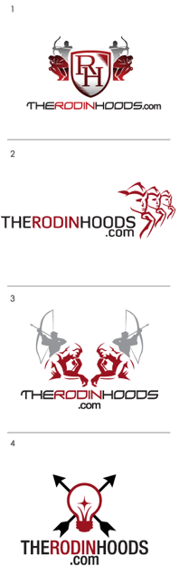
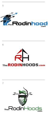
Can you please help all of us as community members, choose the logo / suggest changes to these logos above and or / mix and match ideas etc?
Its important that the Logo has a Unisex appeal, for sure!
Please just comment below!
Many thanks!
******

Jatin Mahindra
I can relate with the Bulb logo. Light emitted in 4 directions.
In the other logos Arrow represent represent something else or may be a cupid.
Sasikiran
1st one and the bulb theme logo. We can go with Bulb theme logo.
Akshay Tyagi
All of them except the one with the arrows through the bulb are very generic. The bulb is obviously signifying thinking. Not sure what the arrows convey?
But it has uniqueness/differentiability, which according to me is more important then significance.
Abhishek Shankar
I feel second one
Nidhi Bala
My vote for the number 3 by including number 4 (the thinking bulb in between)…..that should complete the picture……the colour red should be as is signifiying vibrancy,sharpness and captivating…
Neeraj Mehta
7th
Akshay
No. 7 !!!!
Ashish Bachubhai Tanna
The Light Bulb One is the Best
a few of the Other ones look Like some Footbal Club’s Logo’s or too Warlike
Girish Khera
So i feel all of the above logos have elements that are great, but no one logo really hits the spot.
Here’s what i feel:
1) Shield makes it more of an insignia, very hard to feel like it has to do with social networking / entrepreneurs, more like a men’s club.
2) The attempt at merging Rodin with Rodinhood is laudable but needs to go all the way, right now it’s neither here nor there.
3) Seems a bit forced like archer = robin hood + thinker = rodin + multiple = socialnetworking – feels like a stew of requirements without any interplay
4) Lightbulb is a good approach, but then can’t be a standard incandescent bulb, needs to be more stylized . Also, may be it could be a lightbulb in a sort of “lightbulb farm” with one glowing and spreading arrows to a few more which are lit by the arrows. A sort of idea spreading motif across a network
5) Really like the “R” shape embedded in the thinker’s seat. This is my favourite of the lot, though i do feel the action part of it is lost and not really conveyed by the arrows.
6) I just don’t like this, it feels like the sign you would see on sport shoes
7) Again shield.
Suggestions:
1) The light bulb logo with a little more thought on how to integrate the themes looks like it has promise. You will almost certainly lose the “rodin” + “robin hood” origins, but are they more important or are the “thinking + doing” more important (do you need both?)
2) Maybe take one fully developed thinker in the pose in “3” give him a seat like in “5”, the cap like in “2”, right hand for thinker pose, left hand resting on a bow, arrow resting on the foot of the bow forming the cross of the “h” which is created by the thinkers leg + the arrow +the stalk of the “T” in The Rodinhood.
kinnari thacker dave
My vote for the one where “the” isn’t highlighted…the ones on the right….all of us would be addressed as Rodinhood & not “The” Rodinhood. Its more like a middle name. Next..the green one is apt, as it keeps the audience wandering whether the entrepreneur Rodinhood is thinking or doing. Both this activity seem to be enclosed inside one person in the logo v/s the others where in it portrays 2 personalities / people. The Green logo clearly marries thinking with doing & doesn’t keep them separate. Lastly, the color Green signifies growth, peace, blah, blah.
Ankur
On 1 front, Rodin+Hood means ‘Thinking’ + ‘Doing’. On 2nd front, it is ‘a social networking site for enterprising people’. So the logo should be able to signify both of these things.
Logo 1: Good attempt where sitting man is ‘thinking’ and archer is ‘doing’. It also carries the legacy of rodinhood.com. But somewhere that social networking thing is missing. Also, unable to get the purpose of shield.
Logo2: 3 men ‘thinking’. ‘Doing’ part is missing. Not fully connected to the theme.
Logo3: Somewhat taken from logo1. Shield is missing. Hence seem to be better than Logo1 comparatively.
Logo4: Best amongst all.
Logo5: Again, only ‘thinking’ part. Very difficult to connect the arrows with ‘doing’.
Logo6: Unable to connect anything.
Logo7: A bit confusing as it has all the elements but clarity is missing. ‘Thinking’ man over a shield + hidden man carrying bow n arrow.
Overall, the font of Rodinhood.com is most appealing. So we can use Logo 4 (Light bulb) with rodinhood.com font i.e the font used in logo 1 & 3. This will have an element of legacy (using old font), thinking (Light bulb), doing (arrows), social networking (bulb spreading light in all direction like the spread of ideas).
Saravana Murthy
I will go for the bulb logo.
Syed Sameer
I like #2 overall, however, I’d say give 99designs.com a try.
Ajay Pohekar
No. 4 !!!
Slash Velandy
Clearly no:4 option stands out from the fare listed here. Cheers!
Sanchita Dutta
No 2 and 4 in that sequence!!!
Ankit Bhatnagar
I like the fourth one. Can be improved with a little bit of tweaking.
Aneja Raj
“Robinhood is where enterprising people meet.” To be honest, when I see all of the logos with Arrows, it just connects me to Kevin Costner starer Robinhood the prince of thieves, or men in tights. That is the only thing that comes to my mind. My sub conscious is also telling me that we are just copying from the character, and not being original. The logo that I like is No 2, where there are no arrows, only images of thinking people, that is in line with the spirit of entrepreneurs, people who are constantly thinking and willing to succeed through risk and Initiative. The next logo that comes closest is No 4, although it has arrows, it still reminds me of Thomas Edison and his inventions. We could also think of merging No 2 with no 4.
Apurva Narang
The above logos are just trying too hard.. i guess just the name ” The RodinHoods .com ” in a nice font should do good.
Some abstract element’s could be added, but we can do away with the shields and sword..
for me TheRodinHood.com is a source of learning.. somehow the above logos don’t match that..
Abey John
I like #3 and #4
chirag
I would have preferred simpler designs. They translate well to all media.
No.2 from these (with only one RodinHood).
If you have the time, then perhaps you can use 99designs.com as well.
Hemant Pulijala
Number 7
Bharat Agrawal
Can I play the part of Devil’s Advocate…Why do we need Logo for therodinhood.com. We are doing well without it. Are we not. I agree with Apurva Narang…Therodinhood.com in nice font will make the day.
Kartik R
I’m a fan of shields.. the look classy on merchandise as well 🙂 .. Go with any of the the shields !
Kishor Dashpute
I’m really glad by overwhelming response on this post. Now How we should go about it?…VOTING ::)
Faiz Uddin
Light bulb definitely! Unisex and signifying the spread of ideas
Anushka Shroff
The # 3. The arrouws are an upward significance with thoughts to ideas to actions…is where
Rodinhood grows higher and higher to touch the sky..
Cheers
Alok Rodinhood Kejriwal
wow – i’m finally so confused i have no clue what to do!
Anushka Shroff
🙂 Trust me wid the logo of # 3 coz.I love rodinhoods…*smile* and the number # 3 consists of the “thinker” and “doer” ..ideas+action+thoughts+doing…= rodinhoods !:)
Anushka Shroff
Hi Jyoti..hope u’e doing great…I feel the above logo is looking downwards….with a sad or confused body language…again the “The Rodonhoods” is flat on the ground..signifying stagnation..the color green is nice for it signifies “harvest”….
this is my perception.thots..etc….
would love to get ur inputs.on d same…
Cheers
Abey John
Put up a poll if you want to crowd source the answer. Or go with your gut which is what I’d recommend. Read through everyone’s posts, forget about it for a while and then take a fresh look at the logos again and the right one will naturally suggest itself to you.
Piyush Siinghal
None. Sorry.
Pradeep Chaudhary
I liked Logo #4. may be Try .com in the same line.
Sanchita Dutta
2 remains my best choice 🙂
Sanchita Dutta
thats the best option n perhaps shud have been done at the first place 🙂
Snehal Nimje
arrows(people) meet to discuss concepts (bulb). at theRodinHoods.com. Makes Sense. why ponder over depressed/thinking mann.
Dhruv Mehta
My vote is for logo no 1 & 4.
Sagar Popat
Number 4 or 7
Daman Anand
Alok, check this site http://www.99designs.com
Nayana Somaratna
I recommend gut feel too – entrepreneurs tend to have a well developed gut 😀
Dinesh Punjabi
put the thinking man in the bulb
it signifies the basic concept with what the entire thing was started and also the spark
Puneet Sharma
My vote – Option 6
My take – The word RODINHOOD is awesome.
Its source – Rodin + Robinhood gives the picture of a MAN, a doer. And the name Rodinhood says it all. It needs no other objects like a thinking-man or an archer or the idea-bulb to represent Rodinhood. The name RODINHOOD is the best representation of a rodinhood.
Imagine..Drawing a logo for Sachin Tendulkar, what would be best ?
a bat or a ball or both … or just the word ” TENDULKAR”
Santoshvyas Joshi
Simply “RODINHOODS”…the name says it all
Best Regards,
Santoshvyas Joshi
Shameek Upadhya
Bulb Logo is my choice from these options…
Shameek Upadhya
How about a bulb broken by a rodinhood’s arrow?
Praveen Prabhu
I like the BULB logo, but it is missing the green colour that is predominant with The Rodinhoods, so i would like the Red colour to be replaced with Green & the arrow could be above the bulb like the tiara of an angel & i presume, it will complete the logo!
Ujwal Jain
Definitely option 4 the bulb logo
Viraj Mhatre
The bulb and arrow logo. It fits in subconscious mind without any confusions. The colors should be changed to bright energy colors implying positive wishful thinking. A simpler easy on eyes wide n not tall font will be great.
Nishant Agrawal
I like the second one – it conveys something. Rest are a bit pompous
Tejas Patel
I will vote for the main logo in the middle of the post. Fits with Thinker + straight shooter mentality. This has power and substance in it and has punch.
I like no. 3 too, one side can be a figurine of female sitting and thinking and the other side can be a male. And they are shooting for the stars.
Shahin Ganesh
Taking up your cue from the Unisex appeal and my personal choice it would be logo no 4 the lightbulb but can we suggest lightening instead of arrows?
Kavita Bhupathi Chadda
#7 is relatively more appealing, the colours and font make it all seem more inviting to me. I’d ask the creative team to send work on options taking away the shield in #7 and adding a circle around the thinker and doer imagery… either green bordered-white fill circle or green-fill as is with the shield. I like what a circle depicts – wholeness, continuity, inclusiveness.
Ashish Mistry
Hi,
I feel all the logos and the styles look a bit dated, the options have a lot of components and hence would not garner greater recall. Once can use a wide array of bright colors.
Also think from a usage perspective, how would any of these look on your visiting card, your office stationary, your web page. Should you decide to have an app can the logo suffice as the app icon. Also think about ease to adapt in multiple mediums.
I think simplicity is the key, let it be in one or two colors. Take a look at modern logos adapted by HubSpot, Kissmetrics.
Puneet Nirogam Aggarwal
I Vote for the Bulb. All the others are good as well, but we need to keep it simple, and not too stuffy. And hence, I vote for No. 4 – The Bulb.