Some Rodinhood T Designs!
Which one of these – No 1 or No 2 (or both :-)) would you like to wear?
Any suggestions?
(Click to expand)
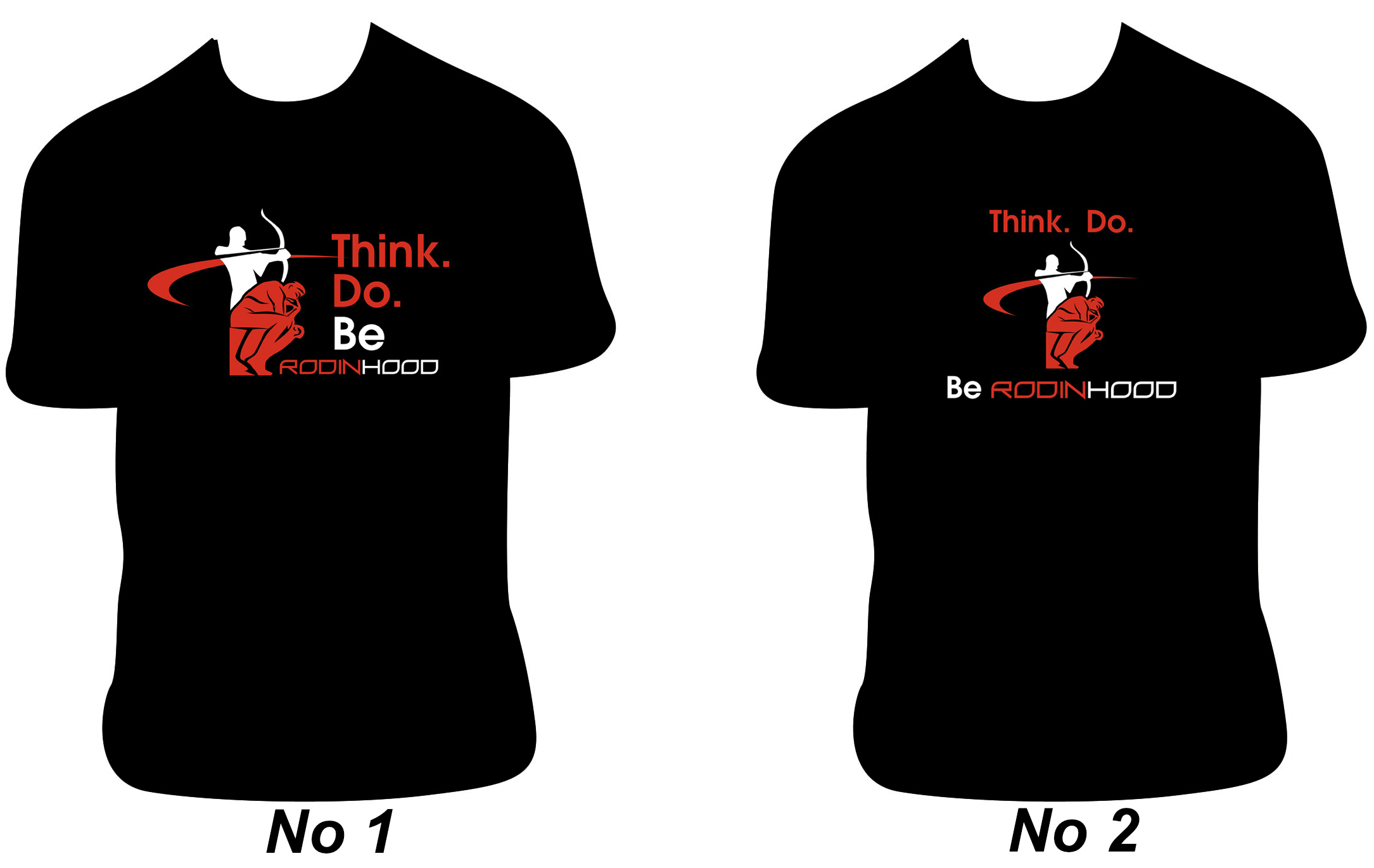
Design Courtesy – Sumesh and Purtata of Games2win.com
******
Some Rodinhood T Designs!
Which one of these – No 1 or No 2 (or both :-)) would you like to wear?
Any suggestions?
(Click to expand)
Design Courtesy – Sumesh and Purtata of Games2win.com
******


Tejas Patel
1 for me. Clear and bold to me.
Prateek Panda
No. 1! Gives it a real nice face-value.
sachin J Deshpande
asha chaudhry
my 2 cents…
No. 1
FRONT: with only the LOGO & RODINHOOD.
BACK: (across shoulders): ThinkDo. RodinHood.
[when u’ve said rodinhood in the front.. means the person who is wearing the tee believes in being a rodinhood. therefore the word ‘Be’ is redundant.call for action not needed! ‘keep parking’ alone works!!!]
also pls consider the broad round V instead of the usual round neck 🙂
Ravinder
No 1
Anamika Joshi
No. 1
Ajay Mundra
No 2 …
Ankit Bhatnagar
No. 1 for me too
himanshu chanda
Number 1
The logo gels well with the tagline and red color in #1
Ninad G Deshmukh
My suggestion
The color scheme should be consistent. “Do” should be in White. Also I agree with Asha that “Be” should not be there.choice is no 2.
Ankur
Without doubt no. 1.
More impactful, the logo is bigger and fonts are larger. Somehow its more catchy.
Krishna Varma
No. 2 is good !!
Piyush Jain
No. 1 Definitely. However the colours can be reversed.
Cheers
Piyush Jain
Akshay 'Backpacker' Chhugani
No 1 🙂
Vijay Khubchandani
2..
Deepak Panigrahy
Logo with “Rodinhooder” at front and tagline at back.
Nameet Potnis
No 1 makes a stronger impression. Its in your face! I love it!
Waqas Ali
1.
Aditya Reddy
2
Mahesh Khambadkone
I feel the colours should be switched – red for the archer – action, white for the thinker – clear. Likewise, Think – white. Do – red.
Personally, I feel a smaller logo on the front – left, chest. Just icon with Rodinhood text.
On the back, just below the collar –
Think. Do.
Rodinhood.
Harpreet Sareen
1
Ankur Gosar
1 🙂
Sanchita Dutta
1,
its more symmetrical, better arranged and soothing to eyes
think, do, be …all three actually form a complete story in itself which needs to be told together in that sequence without a break. this comes out in 1, hence the natural choice
Aji (Digital Marketing)
#1: Also please do print at the back.
sudhen karpe
I ll go for no. 2 n prefer in navy blue...
Amey Asuti
1 scores over 2. ‘Be’ is redundant in both.
Trushal Jethwa
Looks good, but the a part of the logo looks like an inverted nike swoosh. It gives a sense of unoriginality…
Sai Rodinhood Pothuri
No 1.
Thanks
Sai
Saurabh Gakhar
1 and only one…
Praveen Prabhu
1 it is.
Perzen Darukhanawalla
Hi Alok, I think Number 2 represents Rodinhood much better as in the first one it appears that the slogan is think.do.be rather than just Think.Do.
Vijay Khubchandani
Perzen, that’s exactly what comes to mind when somebody takes the first look at the First option..
It seems Think. Do . Be. rather than Think. Do.
Vijay Khubchandani
In fact, we can add an “a” between “Be” and “Rodinhood”.. Like “Be a Rodinhood”.. That way the word Rodinhood would become a Noun, if I am not wrong..
Shahin Ganesh
No.1
Subbaram Gowra
Why can’t the lead caption be “Think & Do” instead of “Think. Do.”
Sahil Ashutosh Mohile
1, hands down…
Murtaza Amin
1
Deepak Sharma
No. 2
Sridhar V
No.1
However I personally feel the website tagline “Thinkers. Doers” is sounding good. If you want it to be a singular word I would suggest “Thinker. Doer.”