
Many people ask me “Alok, the games2win website looks so ugly. Why don’t you make it better?”

You bet I could/should!
The challenge is that whenever I have tried, my 150,000 odd daily visitors get pissed off.
They are USED to the UGLINESS. They don’t care about it anymore. Instead they come for the games they remember or want to find, then they dive in, spend time gaming, enjoy themselves and exit.
I doubt anyone ever comes to games2win just for the beauty of the site.
Now, is that a good thing?
Absolutely NOT!
I wish I had made a better and more beautiful site in 2006 when we started. Or being more practical, gently improved the site rather than wait for it to reach shit’s creek.
This post is about the Curse of Ugliness – the fact that people quickly adapt to what you serve them and get used to it. Changing for the BETTER then becomes a big challenge.
Consider:
The new Gmail look and feel change. One cannot doubt that IT IS better than the old look.
Google team explains it so sincerely here:
But, I know tons of people who are UP IN ARMS and hate the way Gmail has made reading mail more relaxed, easy to read etc etc.
Just check out sample rants here (source – comments under the new gmail youtube walkthru video)
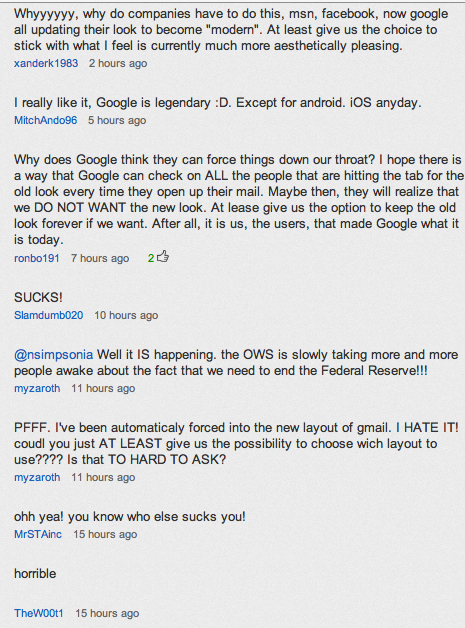
So, the mother and father of all Internet Companies – Google suffers the same curse as g2w?
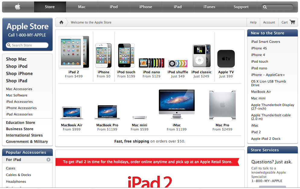
Just as one more example:
The home page of amazon.com

And the home page of the Apple Store
This is my belief:
– It’s easy to be clumsy about design and look and feel. But that clumsiness becomes a curse FOREVER.
Users get used to navigating bad UI and design as long as they get what they want.
That need may be a game or their mail or just the stuff they were looking for.
When you present them a new, improved, ‘better’ look – they REVOLT.
Why?
That’s because the CORE product or service hasn’t changed. It has remained the same. And for the users, there is this NEW complexity to overcome – the complexity of CHANGE.
So unless you are REALLY CHANGING the core offering, don’t mess with the look. Unless you have to.
Trust me, you will be shocked to see falling page views, lesser time spent and lower returning visitors when you make GREAT changes.
Of course, if you are willing to suffer that, then slowly things will get back to normal and POSSIBLY improve.
– When you start with beauty and elegance, then DELIGHT is also what you sell.
Anyone who uses Apple understand this.
The GREATNESS about starting right is that when you IMPROVE something already beautiful – IT DOES GET NOTICED and appreciated.
That’s because it was creating a SATISFACTION to your user in the first place. And when you improve on that satisfaction, then you create even more DELIGHT!
As an example of this, consider the Google Home Page.
Its starkness, its simplicity has been the cornerstone of Internet Elegance.
When Google does commemorate special people’s birthdays, events and even seasons with minor changes to its Logo – it gets immediately noticed and widely appreciated!
– The ecosystem adapts to beauty or ugliness or anything in between.
Nothing exemplifies this better than the difference in the look, and feel of the android and iTunes app markets.
Android is noisy, clumsy and a collaboration of all kinds of designs and sensibilities.
The iTunes App app store is …. well, APPLE.
It’s perfect.
Now, as developers for both markets, its funny but true:
While developing Apps for Apple, we think ‘is it beautiful enough? How will my app stack up against the rest of the beautiful apps in the iTunes store?’
And just thinking of it, we strive to make better looking apps.
When we deliver apps for Android – we are always a bit more casual – a kind of ‘Chalta Hai’ attitude because our neighbouring apps also seem to be of that vein.
To summarize:
– Start with beauty as best you can achieve it. While it may not be your selling point, it will make you memorable and delightful.
– Improve as much as you as you go along
– Change ugliness with caution especially if you have lots of customers; they will prefer the Ugliness to the heartache of CHANGE
*****
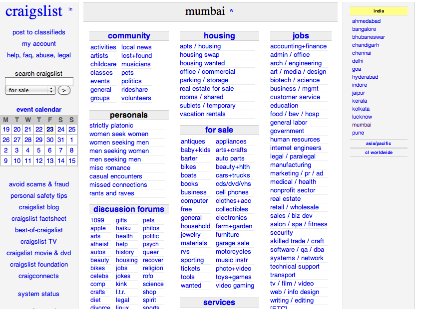
Added this addition to this post after publishing THANKS to the one and only Nayana Somaratna who reminded me of Craigslist.
Check out the home page of craigslist.com shown below.
If you have been living under a rock and don’t know what is Craigslist, just search on google.
It’s also the site that DESTROYED the Classifieds business of Newspapers in CALIFORNIA.
Now, I wonder what they think about Beauty vs Ugly?


Ankur Shukla
This is so TRUE!
When I started Koolkampus.com in 2005, we had a nice clear design
https://web.archive.org/web/20050511014712/https://www.koolkampus.com/
But later when we moved the site from custom code to wordpress, we changed the design as well
and we saw a lot of comments from users that the site was nice but they were used to the old look and feel.
We also saw a drop in CTR on our ads and had to make a lot of changes to the design to get the CTRs back to
the usual.
Changing UI suddenly thinking it would surprise the users is one of the worst things we ever did 🙁
I am one of the people who doesnt like the new Gmail UI changes – its good but I guess I’m more comfortable
with the old look and feel.
Ankur
Harshal N Shroff
A walk through to the new UI is enough…besides haven’t we seen that the more “simple” u make your site the traffic grows…Revolts are bound to happen…cause NO one likes change….bt its short term….people adapt to change…..It takes time….the reactions that we see abt trashing the new UI are implusive just to pass a rant about the “change”…examples-Facebook,Twitter both have had look changes even slideshare,youtube are goin under new UI changes….besides Gradual Deploying the UI and taking feedback also helps….
Pallavi
Its not a matter of design. Its a matter of COMFORT. You get used to operating the site blindfolded so why change.
Raz
Would it work if you try to engage them in the changes?
Like put up an alternate link with the proposed design changes and ask them for their feedback before it becomes live?
That way you proceed only if you have their buy in, else ditch it.
Ashwin C Parulkar
the early look of Rodinhood was much better than this green striking letters
Ashwin C Parulkar
yeh ,but this is not a stock trading site, though Green suggests creativity, and we dont have $ here in India
these are times for Blue -FB,twitter, …you are an ardent supporter of Alok (not to be taken serieously)
Alok Rodinhood Kejriwal
Must read this reply of mine:
Read Quote of Alok ‘Rodinhood’ Kejriwal’s answer to Startups in India: How do websites like naukri.com and games2win.com have pretty bad UI and still manage to do the business? on Quora