
Last month we have redesigned our business critical app upload process on AppSurfer. We have learnt lots of things while building user experience in this experiment. I would like to share few important lessons learnt.
Design Goals:
1. Make process quicker. User should be done with the app upload as quickly as possible.
2. Make process smoother. Understand all the pain points while app uploading process.
3. Let users find and use most relevant features easily.
Earlier app upload process:
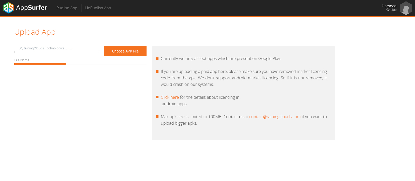
Earlier we used to have a page by page navigation for app upload like shown below.
In first page, user used to upload an app apk. Before going to second page we used to take all the relevant information of the app from Google Play, so that users need to enter less information. [a]
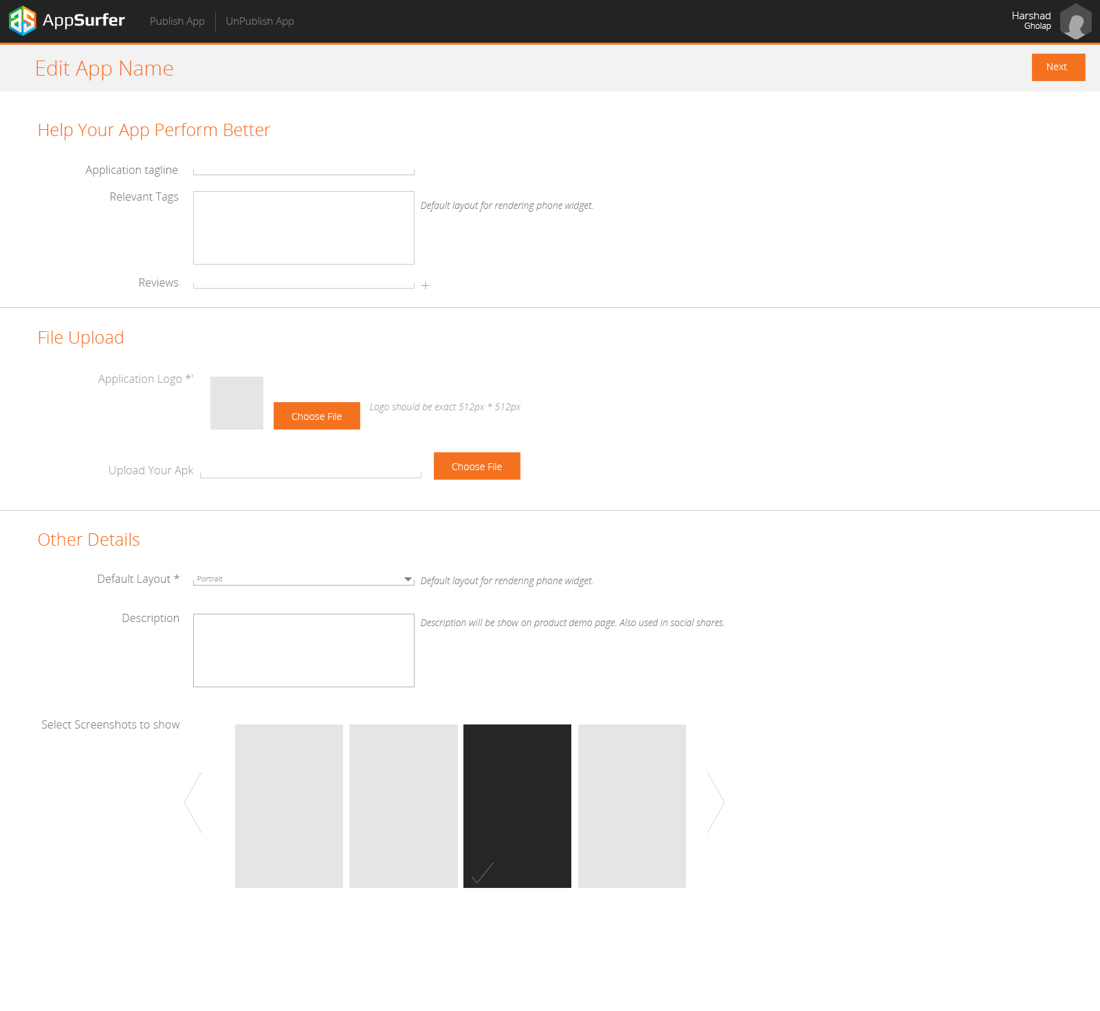
On second page user used to add/edit the app information,
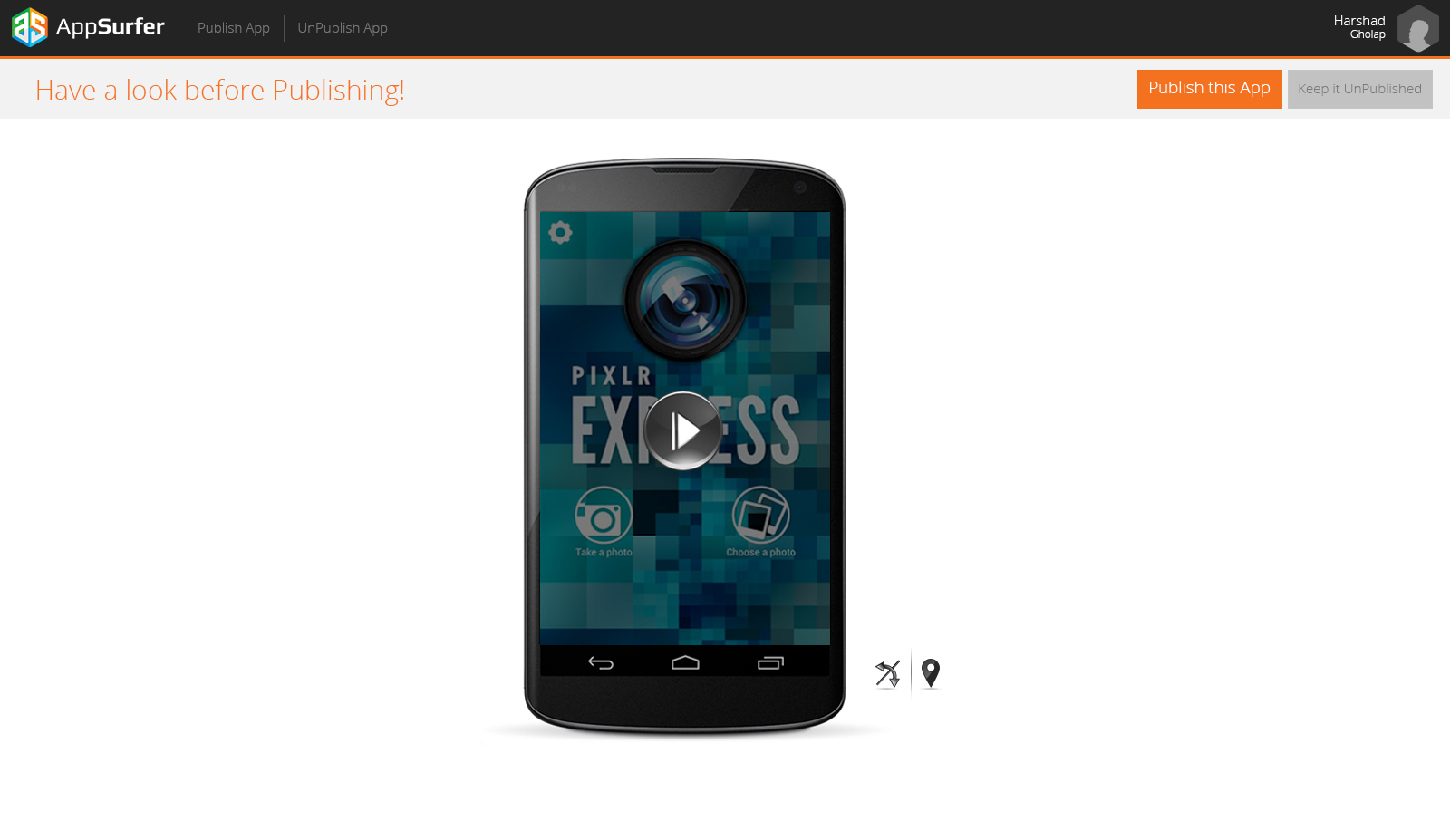
 On third page user can check the working of app on AppSurfer[c]. If user is satisfied with the app trying experience then he publishes an app.
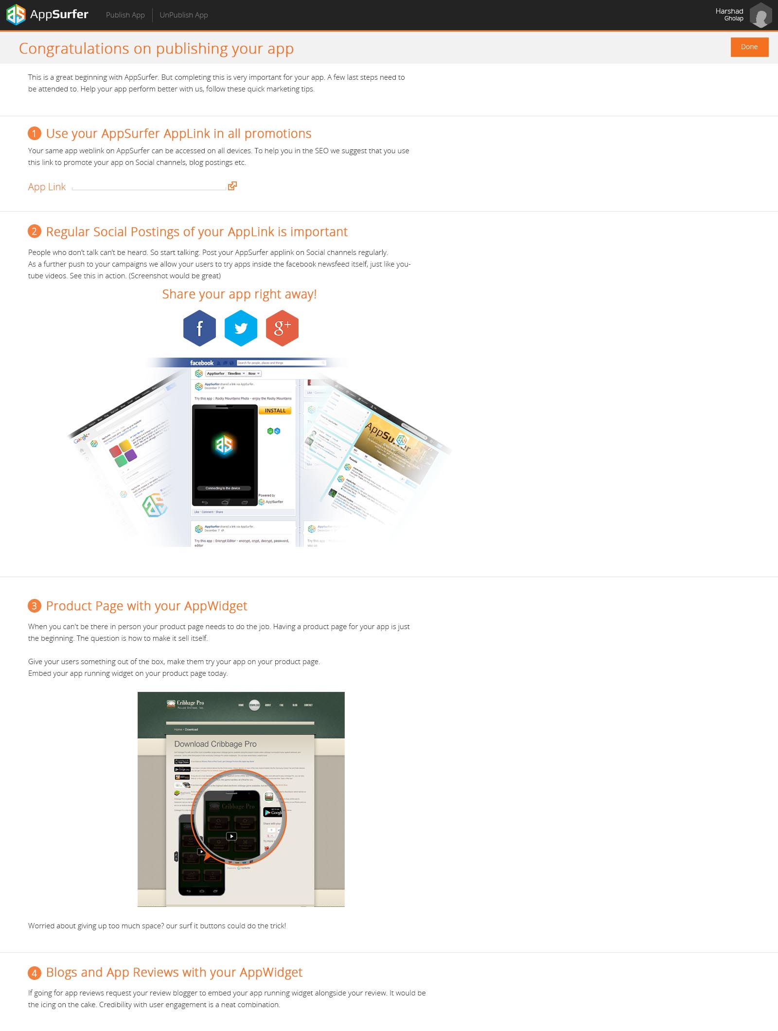
 Then finally after publishing app, we used to show all the information in graphical manner, to show users how to use AppSurfer
 Goal 1. User should be done with the app upload as quickly as possible.
One of the core points while designing any UX system is making users –
a. Aware of the whole process and what they are going to do it.
b. Let them do the stuff quickly and make them move fast.
In order to accomplish the Goal 1, we have decided to let users know about all the process by showing the steps in one look. We have decided to show all the navigation on one screen.
In our earlier case, user used to enter app information on second screen and then used check working of app on third screen. If app doesn’t work well on AppSurfer, then it results in user’s frustration.
We have decided to reverse the order, so that users can check the app working first and if satisfied, go for entering detailed information.
In third screen, our target was to get minimal app information required. Also get app details, like preferred orientation, which needs to be filled by users only. It worked well. Also we have got sufficient time to take data from back-end.
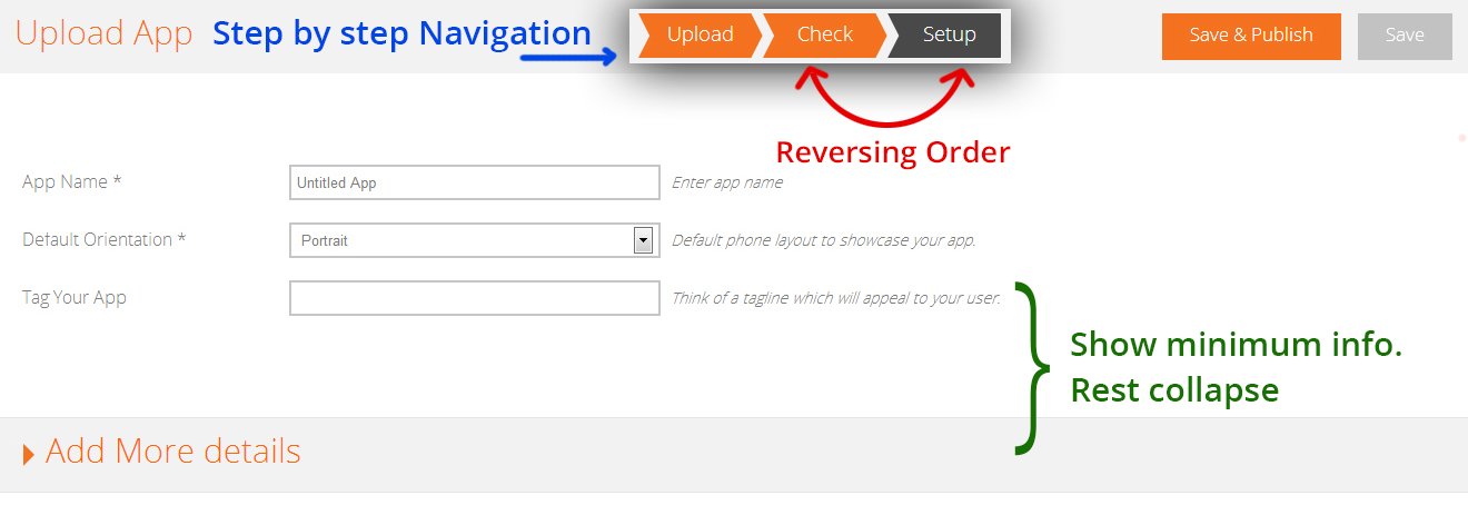
Step by step navigation made users aware of whole process and reversing order helped better user experience. Less information showing helped, users enter information quickly and move ahead.
Goal 2. Understand all the pain points in app uploading process
As this is the very critical process for our business, we have decided to listen to every problem users face while uploading an app. We knew that, what are the possible issues users face while checking apps on AppSurfer (step 2). We have placed ”May I help you?” button, which opens a form. Form consist of drop-down, where we used to show all the possible errors to the users and text-box to enter any other information.
We have directly attached this email to our Intercom account, so that we can keep a track of all the raised errors and solve them on priority.
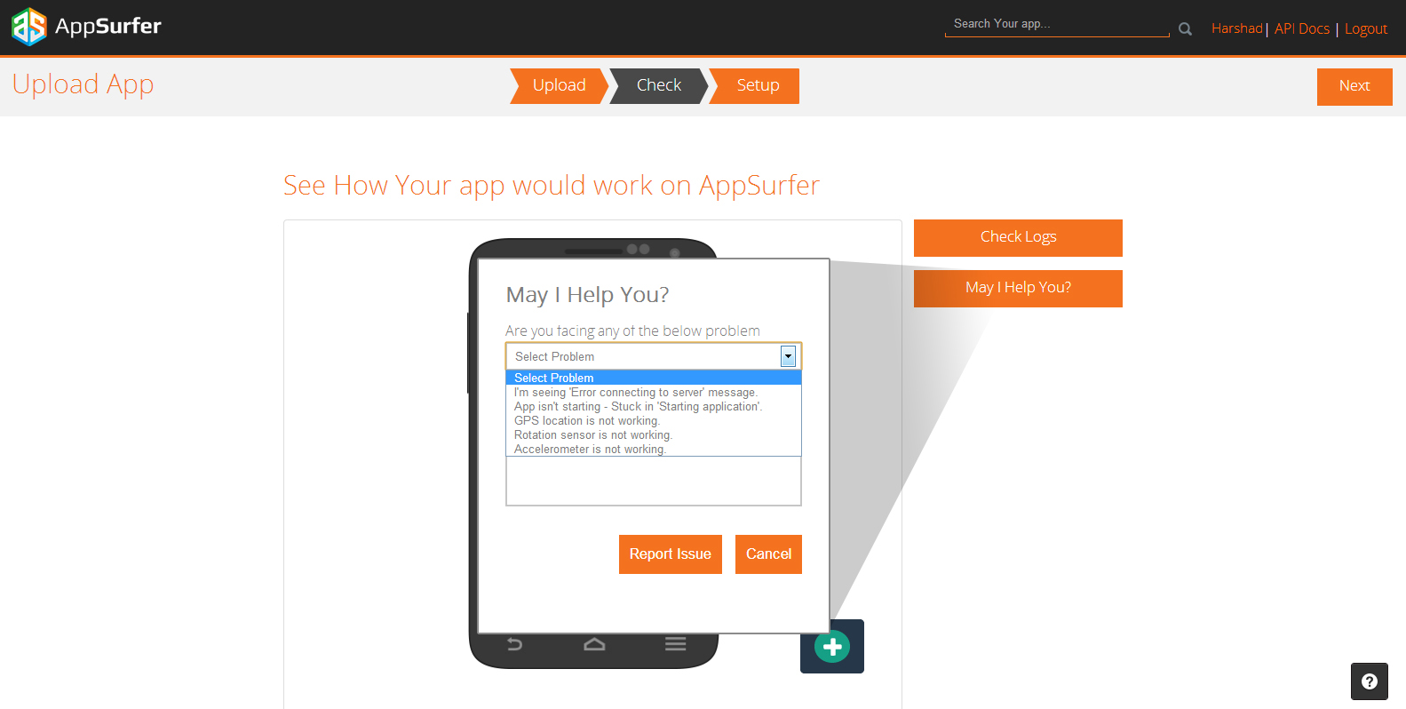
It worked superbly well, we have got very good response from users. We started receiving exact problems while uploading app and issues while working app on AppSurfer. We have handled these request on priority.
Goal 3. Make people use most relevant features in a single click.
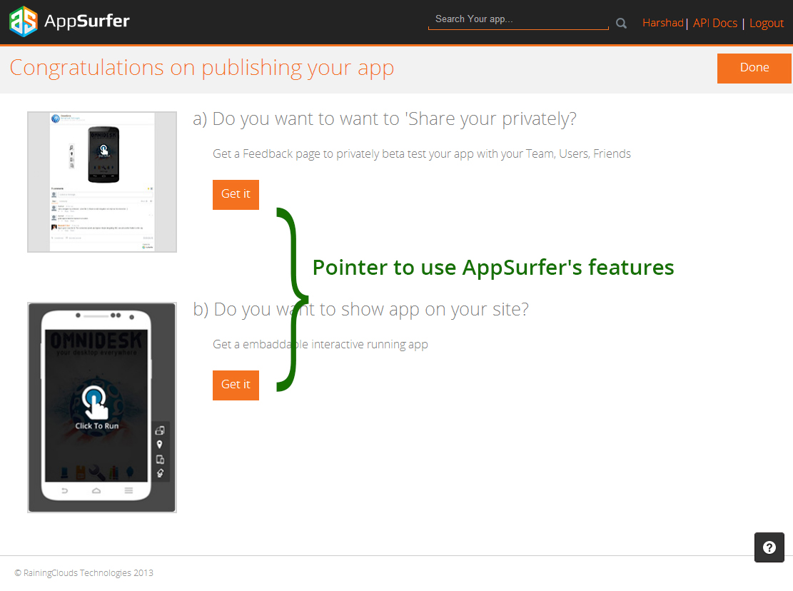
Earlier we used to show all the information and expecting to users to act accordingly. It wasn’t working well.
We have decided to instead of showing all the information, after publishing an app. We should show very minimal information and show them a pointer to use these Appsurfer’s features.
It worked quite well, users need very small information and they directly started going to necessary features screen and started utilizing it. It helped to achieve expected user behavior for AppSurfer.
 What we have realized: The most important thing while designing user experience is make users aware of an information as quickly and as easily as possible.
PS: You may find the same article on my personal blog here