
I took this picture in a mall last week. When i pointed out the use of color behind the text to my husband, he said I'm thinking a lot. But that's what I have become over these years after driving mobile products. Asking users to adopt new behaviors or even modify their existing behaviors is very, very hard. – Khoi Vin, VP of UX at Wildcard
Most of us who have spent over a decade in mobile apps / games [especially in India] don’t have any formal education or certification, we learnt on the job. To back this up I have taken to a lot of reading. That’s when terms like ‘HEURISTIC EVALUATION‘ cross my mind. To dig deep into this science I started looking for ways by which I can add some method to this madness [that I do everyday]. So i picked the Interaction Design Certification offered by University of California, San Diego through Coursera.
As part of the course I had to undertake an assignment in which I had to pick two travel portals and submit a heuristic study on them. As a user, one of the most difficult thing to do is to find gaps in products / services that you use too often. I chose Cleartrip & Goibibo for the exercise. Below are the evaluation results:
- CLEAN & FUNCTIONAL DESIGN [Level : 4]
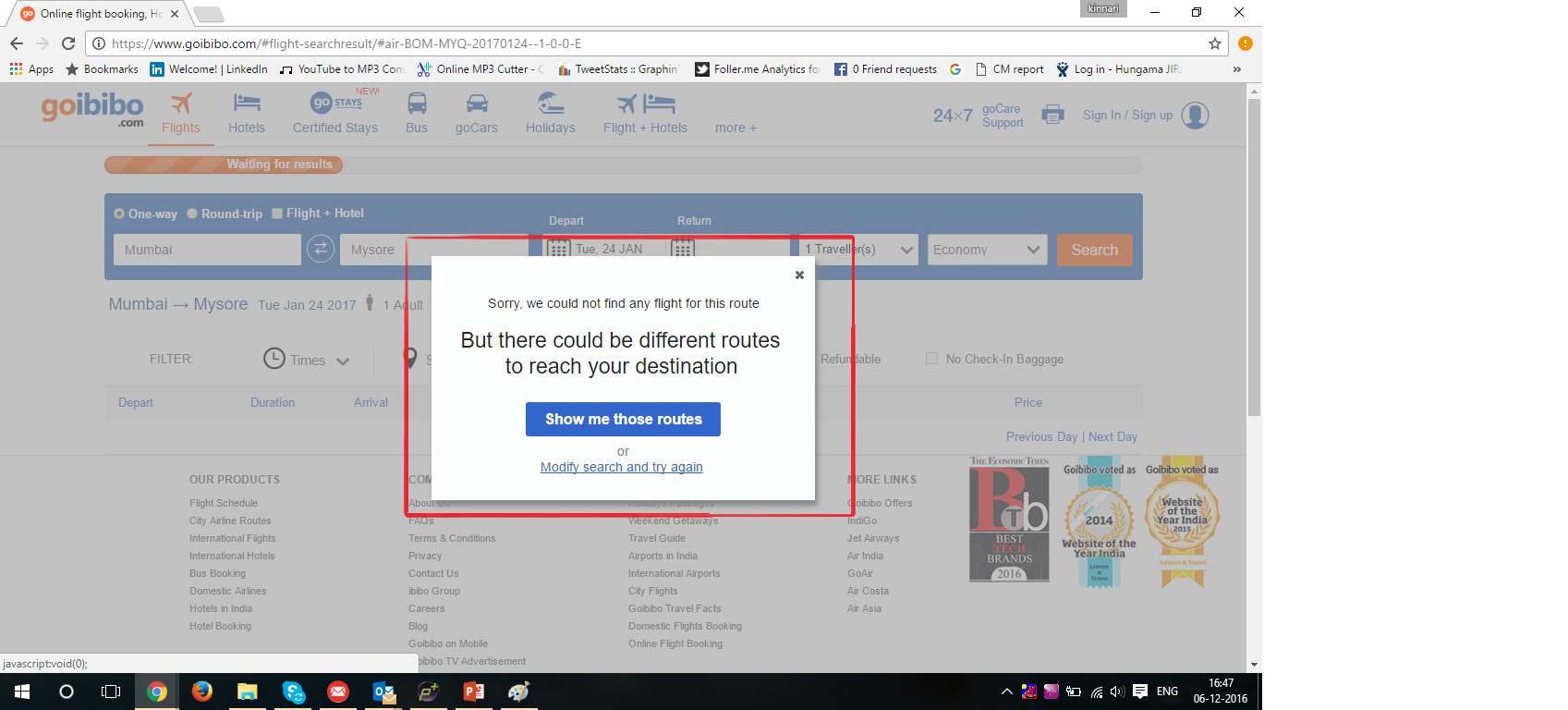
Goibibo.com : I started with searching an air ticket for Mumbai to Mysore. The site returns me a Sorry pop-up. The pop-up message doesn’t tell me whether my dates are a problem or whether no airline flies there. As a user I’m confused. The pop-up then informs me that there could be different routes to reach my destination, thus I was expecting another airport closer to the city or some other way I can reach there. When I opt for “Show me those routes”, the site gives me Holiday plans for the destination. It is something I didn’t even ask for nor did the pop-up explicitly say so.
- CONSISTENCY [Level : 2]
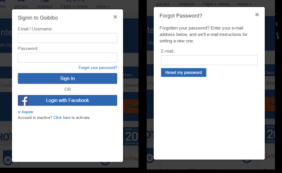
Goibibo.com : As a user when I clicked on Forgot Password on the sign-in pop-up, which I could have done by mistake. There is no clear back arrow to return on the Sign in page in the Pop-up. I used a combination key on my key board to go back.
- CONSISTENCY [Level : 3]
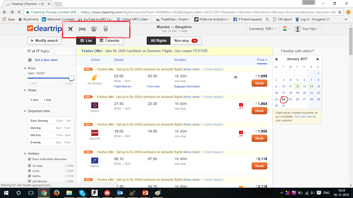
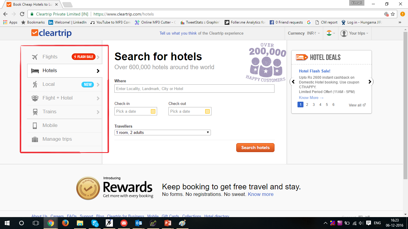
Cleartrip.com : On the results page of flights, when a user clicks on “bed” icon [representing Hotels], it opens a new page. The navigation moved to the left from the top right corner. The users expect consistency in navigation.
- CONSISTENCY [Level : 2]
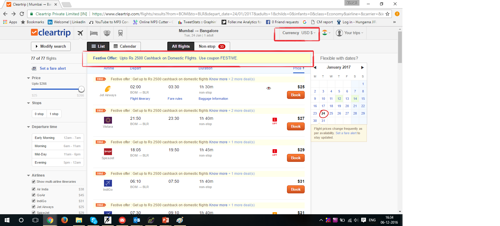
Cleartrip.com : I could be an international traveler using the site and I opt for $ as my currency. Though the fares displayed are in $, the accompanying offer is in INR. The user has to manually calculate the discount. Also,from the payment page, when I opt to return back to search page, my currency preference is re-set to INR.
Like someone said : ‘Do it better’ rather than ‘doing it first’. Cleartrip & ibibo have build some very good products. As users and user habits evolve we would all re-think the way we do things.