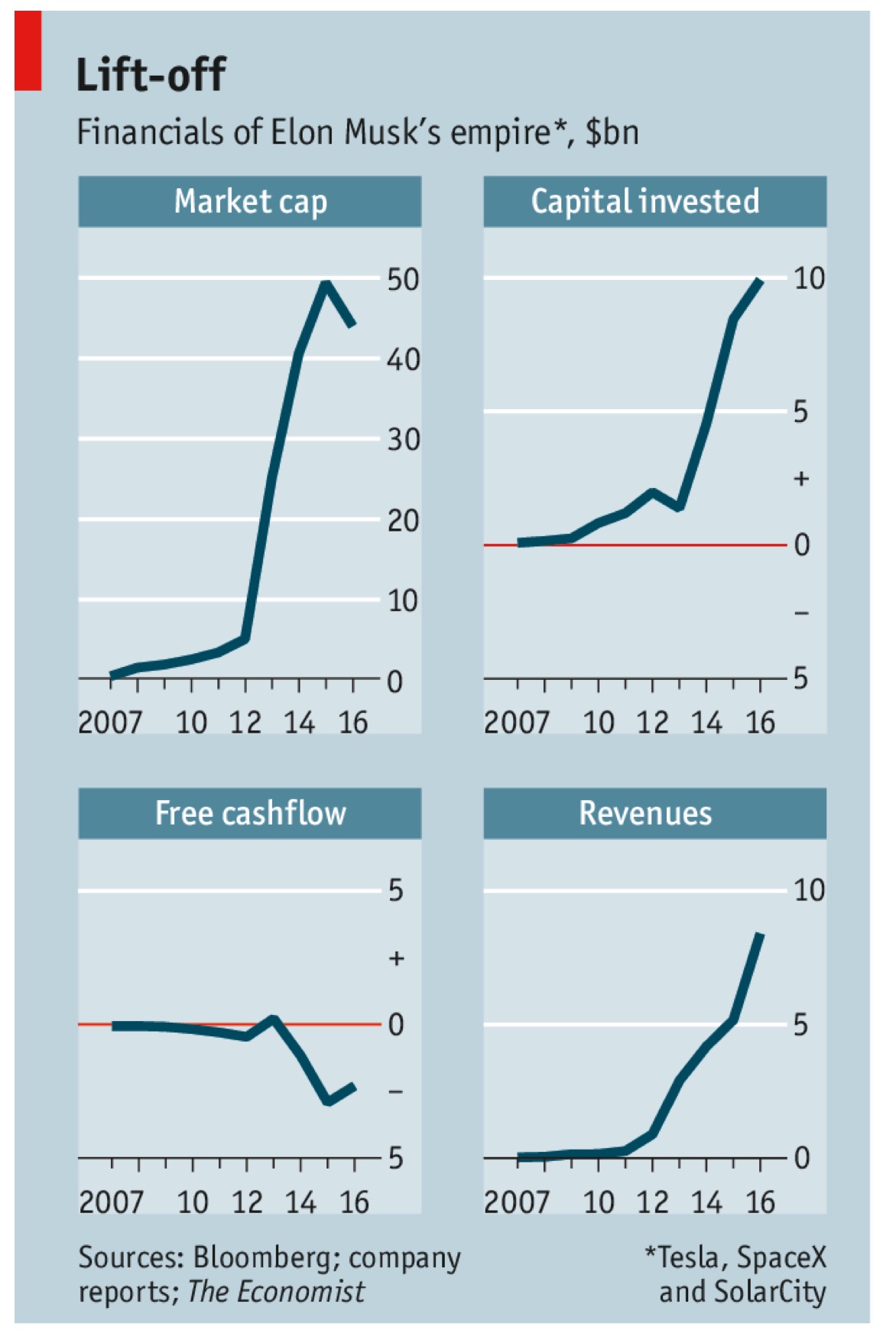
A graph picture set from the past week’s Economist on a story on Elon Musk and his business caught my attention :

Sure, it describes the glory of Elon Musk…

but as hard nosed businessman and street toughened entrepreneur, I found 1 graph completely missing in this set of 4!
Interestingly, when I looked at this picture again, it seemed to me that it could be applied it to almost all the so called ‘Unicons’ (oops – Unicorns) that boast of massive sucesss on metrics that are all too well represented in this picture.
My question to you is – which is the graph that’s missing and how would it’s inclusion totally change this so far beautiful looking picture?
If you want a better perspective before replying, read the well written Economist article here !
Comment away and let’s hear from you!
***
Very excited to write this post entirely from my mobile device!! Long live WordPress!


