Awarded the
“RodinStar” Post
of the week!!
We always want our presentations to speak out for themselves. Though content drives a presentation,what could be better if we were able to design it in a good way.
As entrepreneurs, we are, often, short of budget to hire a designer. Explaining the content to a designer, so that he can add value is yet another challenge. Presentation creation softwares have their own learning curves.
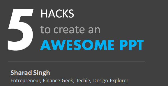
While creating & designing PPTs for myself, I have learnt a few things over time. I have collated the same in the presentation here. These are hacks which anyone of us can use effectively without the need of any special knowledge.
I hope you will find it useful. Please feel free to comment. Also let me know your hacks and tricks which have helped. I would be happy to include it in the PPT with due credits.
[Ps – If you are browsing via a mobile device, click on the IN logo (linkedin) and directly view this deck on slideshare. The UX is much better :-)]
****
If you found this useful, go through Alok’s 27 presentation tips!
*****
Originally posted on TRH on June 23, 2015
*****


asha chaudhry
this is neat sharad!
i particularly liked the icon & infographic bit.
thanks so so much!!
Sunaina Shenoy
i particularly liked the image selection and infographic pointers.. very useful.. will keep refering to this. thanks sharad
personally for me getting the right design for a ppt is a constant work in progress though canva has been of great help. three things that i have often been reminded by my colleagues wrt good ppts – use only one image per slide, do not write more than 5 lines in one slide and instead of using bullets try and explain each of the bullet as separate slides
And, they all seem to be working right as of now..
Elroy Serrao
For color combinations an amazing resource is : https://color.adobe.com/explore/newest/
Hope that’s helpful
Alok Rodinhood Kejriwal
I never could crack info graphics because of the the time required! Thanks for the inspiration!
Sharad Singh
Thanks Asha.
Icon one is my favorite as well.
If you look at the hacks, they are quite interdependent. For, example while creating an info-graphic or an icon, we would need picking and merging the colors (explained in the Color hack). For info-graphics; icons and typography become an important part. Essentially, they all add-up to create the desired effect.
Regards,
Sharad
Sharad Singh
Thanks Sunaina. I am happy that you liked some of it.
The 3 pointers that you have mentioned are bang-on. They are the essentials and work very well.
Regards,
Sharad
Sharad Singh
Hi Elroy,
That’s really amazing. Thanks. Shall mention this in my next edit of the PPT.
Regards,
Sharad
Sharad Singh
Aha sirji.
You liked it. That’s an inspiration for me 🙂
Regards,
Sharad
asha chaudhry
sharad,
i spoiled the top of your post. sowrie!!
🙂
Sharad Singh
Oh wow. That’s the Oscar… 🙂
PS: I was looking around here and there to check what you meant… and then it caught my attention… 🙂
Many thanks,
Sharad
Vijayakumar K
Great article. Thanks Sharad!
asha chaudhry
hey sharad,
have you ever tried slides carnival?
chk this presentation out – it’s awesome!!
https://www.afaqs.com/all/news/case_studies/reports/393/HTML5/index.html
Sharad Singh
Thanks Asha.
Great collection of templates. Will take inspiration from the collection 😉
The presentation is cool. Minimalistic is the new order… 🙂