An awesome webpage requires a truly creative mind. One of the best methods of starting out on the design of a new webpage is the mind mapping process. For the creation of the CLASH OF TITANS Contest page too, we first needed to prepare a design in our mind. Once we were sure of what we were going to create, only then did we start implementing it.
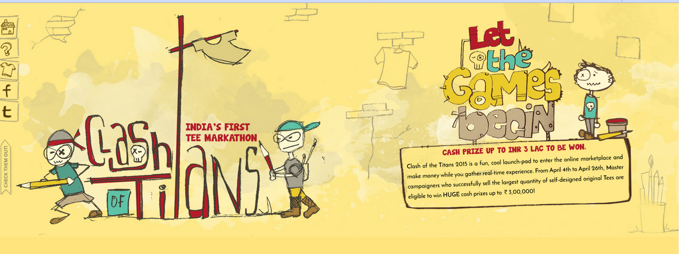
The creative brief given for the CLASH OF TITANS webpage was to create something modern and young in feel while being retro in look. We kept this important input in mind while creating drafts. We also knew that our website should be user-friendly, attractive and have a ‘stickiness’ factor attached to it.
5 design elements that created a quaint, old-worldly webpage
- We created fun, quirky characters — keeping in mind that our ultimate audience is between the ages of 18 to 35 years.
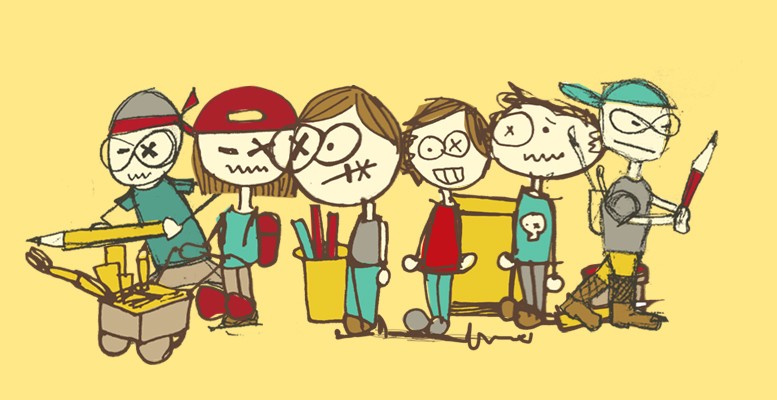
- We intended to create a space which people would want to explore and play with. The navigation buttons and other small elements of the web page are intended to engage our audience. The small but interesting elements we used in creating this design were funky pencils, t-shirts here and there.
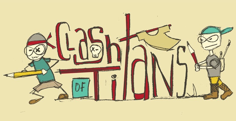
- The colours we used too were also important. The colours were used as a character itself. The color theme is set keeping in mind the current trend of using solid color, while still giving the page a retro look!

- Every character has been painstakingly hand-drawn and then converted into digital files. All of the tiny detailed characters perfectly represent the mood which we are trying to portray. Almost all of the typography seen on the website is hand drawn as well. We didn’t want to compromise with the quality of graphics.
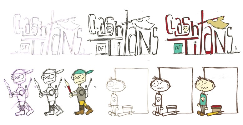
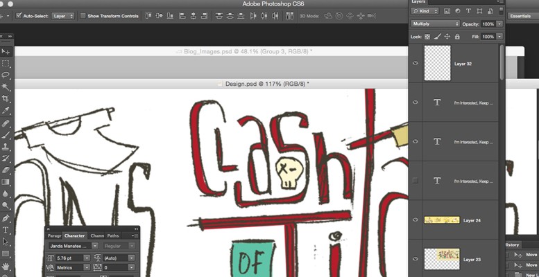 Even the background of the website has some subtle elements which enhances the old-worldly, whimsical feel of the website. This makes the user want to experience and further explore a new world.
Here is the finished web page, Take a look! www.mydreamstore.in/contest
While we wanted our design to be original and innovative, we also had to bear in mind that the webpage was a landing page meant not only as a positive marketing tool but also for lead capturing.
What makes a Landing page complete?
Along with good design and quirky creativity, we have included all important elements needed for creating an effective landing page as well. A landing page is a web page that allows you to capture a visitor’s information through a lead form. A good landing page will successfully target a particular audience and answer the following questions they may have about your product or service.
These are four main features for a good landing page to have:
· How/what will the visitor profit if they give you their information?
· Why is this service or product a must have?
· Create a sense of urgency around your offer
· Simplify the process of signing up/registering as much as possible
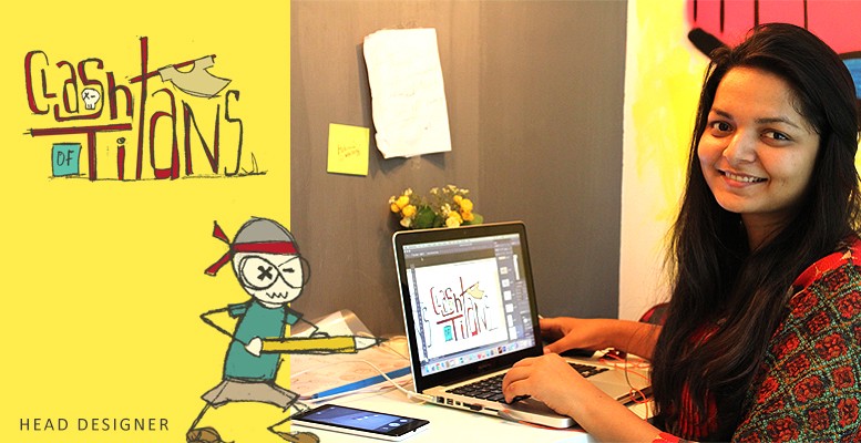
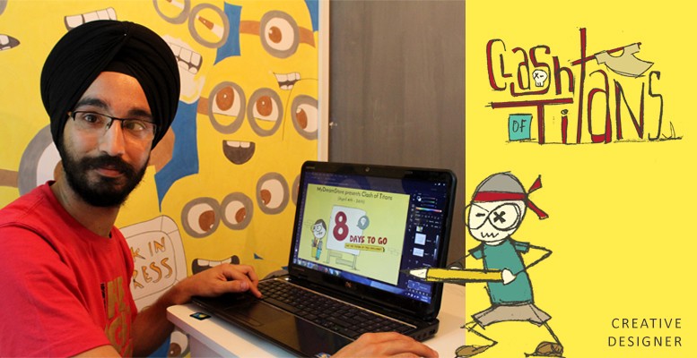
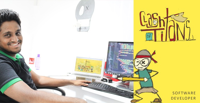
Here’s the Team behind this!
About My Dream Store: We are platform for people to create & sell custom t-shirts with out any upfront costs or hassles. Have a look at – www.mydreamstore.in
@_mydreamstore @_karthikvenkat



asha chaudhry
this is just so awesome karthik!!
I LOVED THE CONTEST PAGE – EVERY SINGLE THING ABOUT IT!!
“simplify the process of signing up is very imp” – do let us know how many new signups you got post this contest was announced.
karthik – a quick one – since we have many newbies on trhs – in your intro para just add 2 lines about mydreamstore so everyone knows that you are a marketplace for tees… it helps connect the dots!
all the best. may the best tee maker win!
Karthik Venkat
@Asha – Thanks! We’ve got more than 300+ people registered exclusively for the contest. Our website traffic got tripled in this process and few people are interested in trying out the concept. I’ve added about My Dream Store at the bottom.
I wish to get some participation from TRHS as well 🙂
Prashant Pansare
Awesome stuff !
Satish Medapati
Pretty cool!