Happy Diwali to all Rodinhooders. Wishing you a prosperous year ahead. I am back with another post related to web analytics and what better day than Diwali.
This is a series on Web Analytics (my previous post was on “Into the Web Analytics War Room: Achieving More than ‘what matters’ using Visual Analytics“). This new post is related to another aspect – “Form Analysis“, which usually gets neglected by most of the web pages.
Before we dig into the matter further, one of the preliminary questions to ask yourself would be, “How do you analyze the success of your forms?”
Consider a simple case of a contact us page which has fields like Name, Email, Mobile, Country and Message. 60% of times web owners will just gather the information and feed into the marketing tool as a probable lead, and this process just iterates. What if we add an analytic component that provides you information to help you to make the forms better and make it ‘really’ submit it?
Never lose sight on the last step of conversion
The form analysis can be classified in two broad ways:
- Data Report: Understanding the submission, average report submission time, Understanding how many people leave your form without submitting, etc
- Data Analysis: Understanding which fields users take more time to submit or don’t prefer to submit. How much time a user spends interacting with each field, along with which fields are revisited by the users. Do they just get a sample of field hints or all?
8/10 users don’t like to submit a lot of data over a form, unless very important
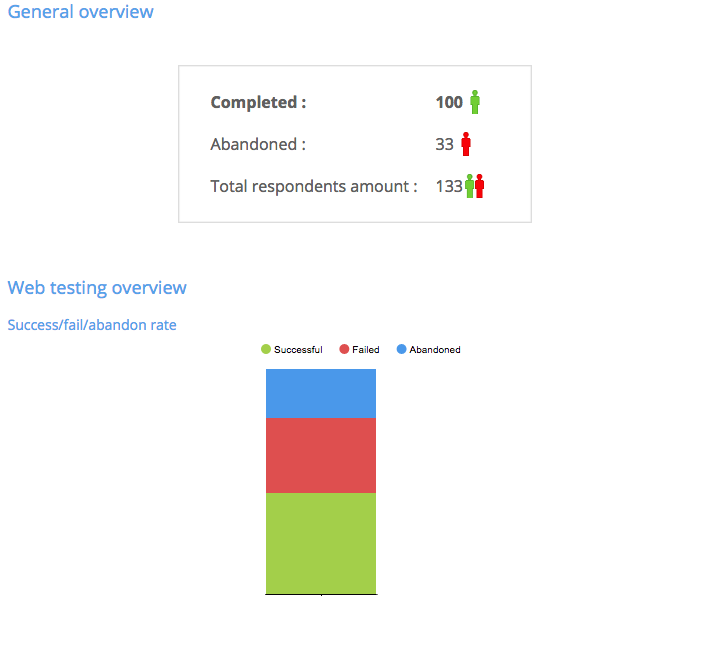
One of the better ways to understand the submitted reports is using representation. Take a look at some of the results you can gather based on submissions. This report was generated using Usability tools which shows the total v/s abandoned submissions. The abandoned submissions can be due to the issues while submitting or user moving off the page.
There can be several reasons why a user leaves the page and to understand this, several experiments are needed. One fact goes untold that, 8/10 users don’t like to submit a lot of data over a form, unless very important. Please ensure you ask users only the most required fields than asking all details which he/she might not be interested in revealing at the first go. Make the user want to fill the data and not force him/her to fill it.
This can be achieved in two simple ways:
- A form embraced in a beautiful, responsive and quick-to-load layout
- Less elaborate questionnaires ( or only-to-the-point questions).
Another way to sort this understanding is to implant Heat map to see the click, scroll and mouse moments on the form page to take your understanding to next level.
e.g: If your form has more than 10 input fields, using heat map you can figure out whether the user has abandoned form submission without scrolling or whether the user typed few fields before quitting.
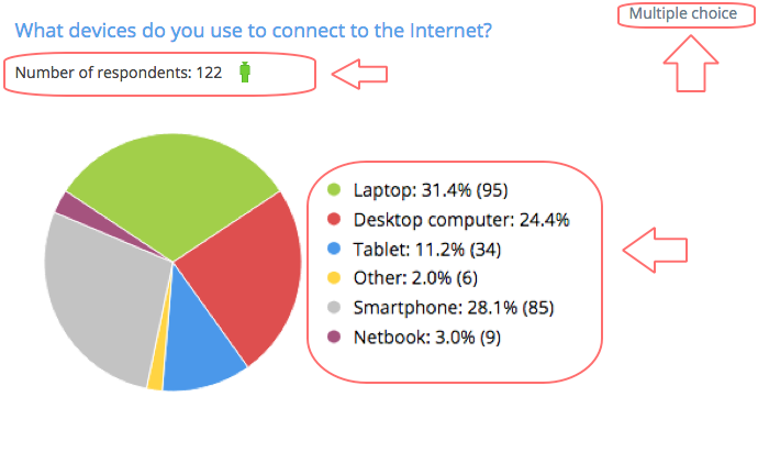
Sometimes, not all the fields are mandatory so synthesized reports are the best way to yield results. The results submitted by the form can also be graphically represented irrespective of the field input type (like Text field, combo box etc). Take a look at one such analysis below showing total respondents.
Additional information that can be gathered in data analysis:
- Average task time to submit the whole form
- Average page visit per session
- Average page visits
- Form submission timings (based on GMT)
- Browser Type and Versions
- System information from where the submission has taken place
- Location information (which can then help to have locale approach to different countries in case drop-outs increase)
Not to forget, sometimes drop-outs happen due to form’s scripting issues. Make note to fix the “submit” errors and improve form usability and submission rates.
Reduce customer frustration while he/she enters the form
The second analysis is revolving around the pattern of understanding user’s behaviour on the form. Your role is to understand one simple fact: Reduce customer frustration while he/she enters the form arena. Understand which fields cause users to abandon the form, or which fields take the longest to fill out.
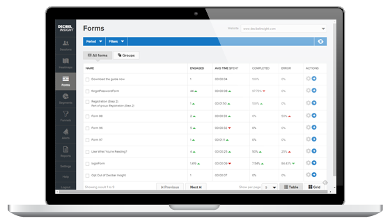
This same report can be compared against the average submission time to check on the fields that actually take a lot of the user’s time. If you have multiple forms on the site, find which forms are working fine, which forms are creating friction and which forms are experiencing visitor-pull offs. Decibel’s insight Form analysis tool can help you estimate. Take a look at the image below which shows form-wise details.
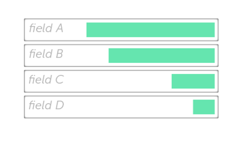
I personally feel analysing fields in the form can help gain a lot more information for further tweaking and conversion improvements. Take the case below. Form’s fields A,B take a lot of time to fill, compared to others.
Several assumptions can be drawn from the report:
- The fields A and B are taking longer average time than C and D
- Probably fields A and B are expecting longer text inputs or data
- The fields’ hints haven’t given them enough insights on what to type (to confirm this point, analysis on data field edit is needed too)
Based on the points above, the form elements could be optimized to reduce average submission time.
The report is generated using Decibel’s field analysis that allows us to capture several aspects including:
- What is the time taken by each field to complete?
- Frequency of each field that causes abandonment
- How often is each field amended after completion?
- Which are the unnecessary fields which users skip?
- What is the content size users fill the data as?
- What is the Drop offs time in the Fields?
- How often does the user correct the data after entering? (This helps understand whether the user has filled the data wrongly, or the hint provided wasn’t clear enough or overrode the decision to fill the data)
Using this data you can get a complete picture to improve website forms by adjusting or removing form elements that contribute to visitors’ friction. Also, take a look at the report generated by MouseStats after a form research.
Try out these analytical tools for understanding what you can improve in your web forms and to subsequently increase conversion:
- MouseStats: https://www.mousestats.com
- DecibelInsights: https://www.decibelinsight.com
- UsabilityTools: https://usabilitytools.com
Stay tuned for the next edition of Into the Web Analytics War Room. In the next article, I will be taking this topic to the next level to discuss what ingredients can a web form have to yield better conversions.
Do get in touch with me on Twitter ( @prajyotm) and Facebook ( /Prajyotmainkar)


asha chaudhry
#FormAnalytics !!! wow – i think a lot of e-com players are really really gonna benefit from this one prajyot! it’s interesting to see how you decode the minutest detail and share it as an insight!
Arpit Choudhury
Thanks for sharing this Prajyot, it’s really helpful!
Alok Rodinhood Kejriwal
very nice and detailed
Alok Rodinhood Kejriwal
One of the best examples I know of ‘form success’ was the gamification of form filling
Just at the top of a largish form were the words “The world record for completing this form is 13.9 seconds”
Everyone filled up the form and fast
Prajyot Mainkar
Thank you so much for your comments
Prajyot Mainkar
Awesome stuff. Great to know from you. Indeed a great idea to implement
Prajyot Mainkar
Thank you Arpit for your comments