I LOVE making PPTs over the odd weekend. In the last 15 years or so, I’ve made at least a hundred presentations in front of various audiences. People have appreciated these presentations, so this is my attempt to share some of my personal PPT-making tips. Hope you find it useful while creating your next presentation!
Pls note: In the PPT, The Tip slide is in Blue italics & is followed by an Example slide. So don’t get confused on what is the TIP and what is the EXAMPLE
Do share some of your own tips in the comments!
This is the template of the extra’s you can do to add more magic to your decks!
UPDATE ADDED BY ASHA:
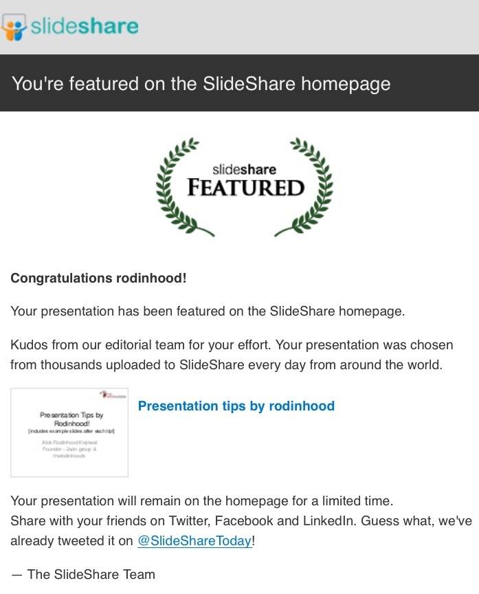
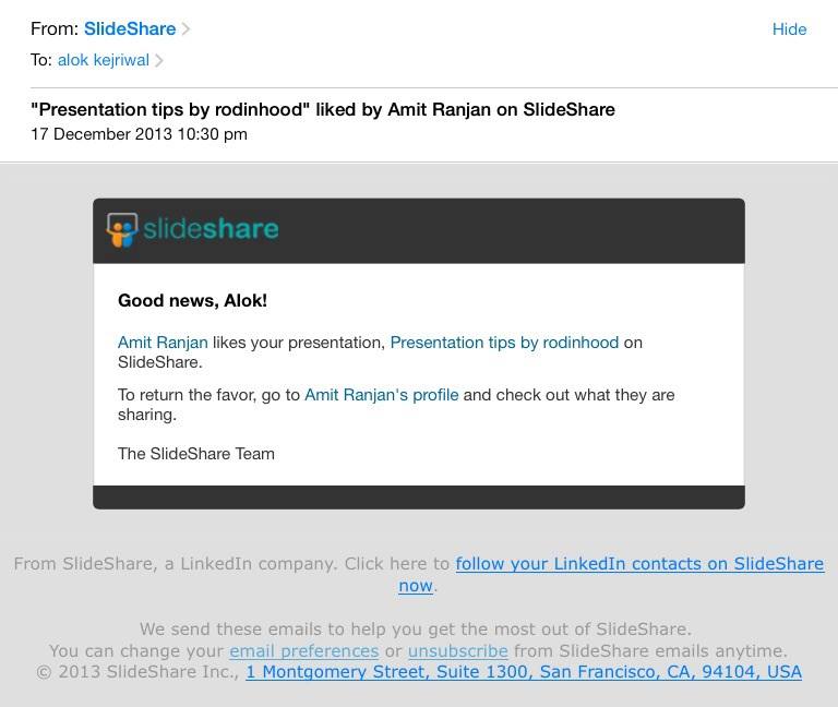
Within a few hours of this ppt being posted on SlideShare and trhs, it got featured on the slideshare home page and liked by the FOUNDER of SlideShare. How cool is that?!


Sidharth Udani
Just would like to criticize you on the point that somehow images with one liners(Slides 9,11,13, especially 15) are not in sync to a great presentation. Not that I am a ppt expert but even in rodinhoods open house, I disliked the pics you have selected full screen with a one liner in awkward font and position,
The tips which you want to convey are great. But just hoping that someday I might see your ppt in slideshare top ppt’s of the day i.e. by making it visually more pleasing and wise choice of pics. Sorry for being blunt, but I am sure you wouldn’t mind. Om Babaji Om.
Shobhit Bakliwal
Very confusing ppt. Sometimes, I had to go back and forth 2-3 times to understand whether the slide was an advice or an example. You should have had something like a header to indicate that this is not an actual example but an advice.
BAD UX.
Alok Rodinhood Kejriwal
Thanks. Changing the color of the fillers
Alok Rodinhood Kejriwal
Don’t agree.
Ps – 3 ppts have made it to the homepage of slideshare.
Shobhit Bakliwal
Looks great! 🙂
Sidharth Udani
Great that 3 of your ppt’s have been on the homepage, but I predict thats bcoz of your fan following. 😛
Alok Rodinhood Kejriwal
:-)) the ppt just got featured on the slideshare home page AND got liked by the FOUNDER OF SLIDESHARE (not a fan :-))
Anoop Nair
Haha.. This is what we call the real achievement. Good to be in your network Alok!
Jatin Bhandari
Nice Share. Slide 17….Where is the difference Alok ? ….
Darshan Bhambiru
Was only meant to WAKE up Sleepy Heads 😉
Rohit Jain
HI Alok, Nice ppt…couple of tips are quite useful. We shall give this as reference to the people who are creating online courses of ufaber.
Pawan Deokule
Thanks Alok,
I can see why it was chosen as a favorite on slideshare. The simplicity is superb and the logical flow is also great. I usually get stuck when I am following someone else’s format like business plan PPTs where they ask you to use large font and fit tons of information in a single slide with multiple messages! I would like to use your simple format but that can be done in personal presentations, the official block presentations come with conditions. 🙁
I had a few clarifications on going through the above. Trying to learn and adapt here….
Not sure what point can be made with slide #13? If the team size is large then great we can say big team, beautiful team, etc. If the team size is rather small as is the case with most of our network of startups then the point of unknown faces having a table snap may not be as appealing. Not sure if there is any other point that can be made.
Learning…
Ranga Prakash S
Cool 😀
Bhaskar Jha
What I infer from slide#13 is to show who are behind the scence; who are the forces behind the product. It could be a large team, a small team of enthusiasts, two brilliant minds or just a single genius. Like in some theater group, it is customary to bring in all the artistes on the stage after curtain falls. It is to show solidarity within the group or company.
I am still learning too, though hope it helps.
Bhaskar Jha
Brilliant is the small word. 🙂
Hansi Gehlot
Nice Tips. It is very useful to me when I’ll create Presentation. Thanks for sharing such a great information here.