So, I may have become a bit Insane.
Maybe, Steve Jobs’ ghost haunts me.
Maybe his soul has entered my head.
Maybe I have just become obsessed by him.
Everything I see; specifically on any ‘i’ device – be it an iPad, or an iPhone, makes me go into the neutron of its design and figure out if it’s exactly the way “I would like it”?
It really hurts my eyes, my sensibilities and my heart when the biggest brands in the world do a shabby job in the holy world of ‘i’ art.
It signals to me that these brands don’t respect the ‘i’ universe. They don’t ‘get it’.
Don’t the managers who put out this stuff use iApps themselves?
Well, even the biggest and the brightest sometimes need to be taught some good manners…
So, let me serve you some not so great stuff from some very very great brands!
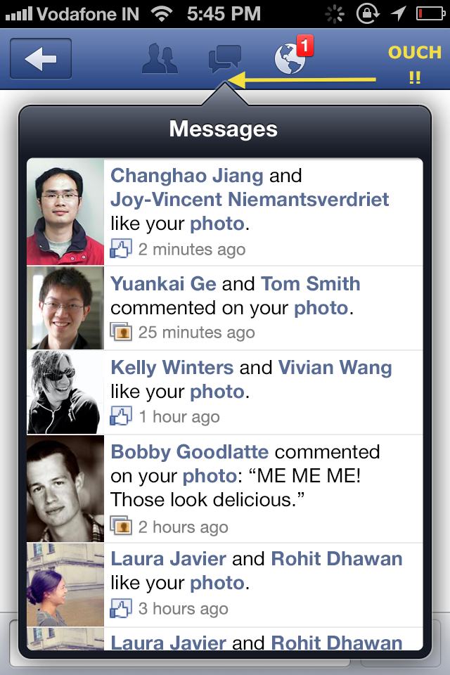
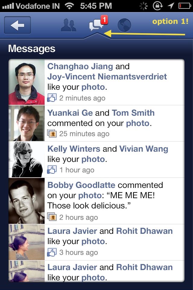
Facebook – terrible notification design in mobile messages 🙁
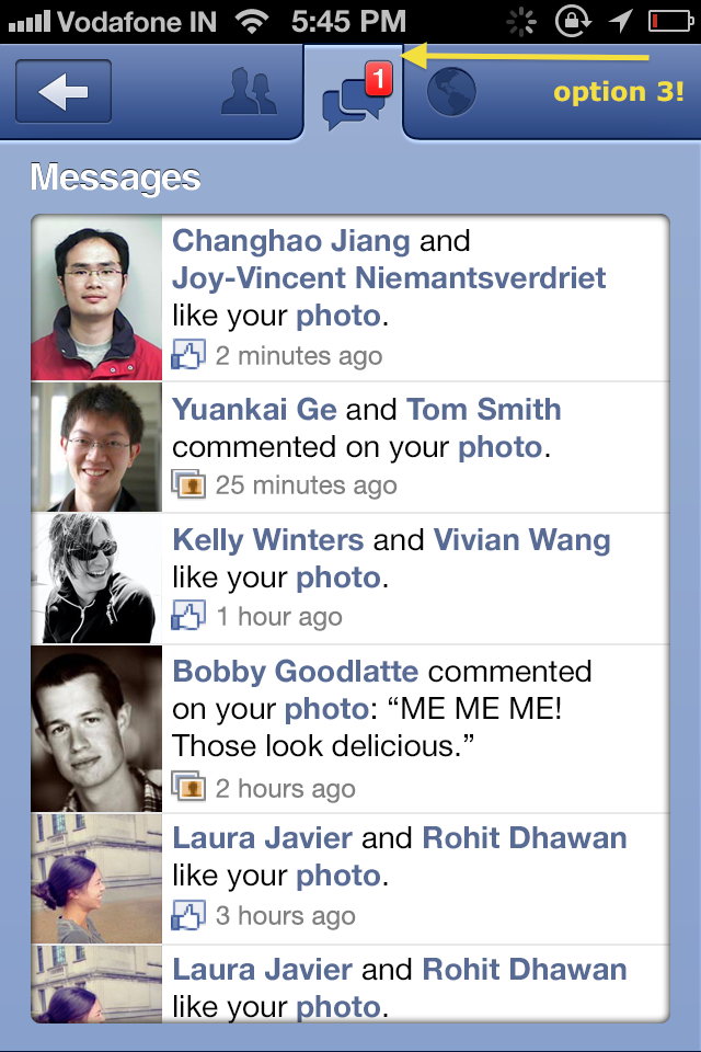
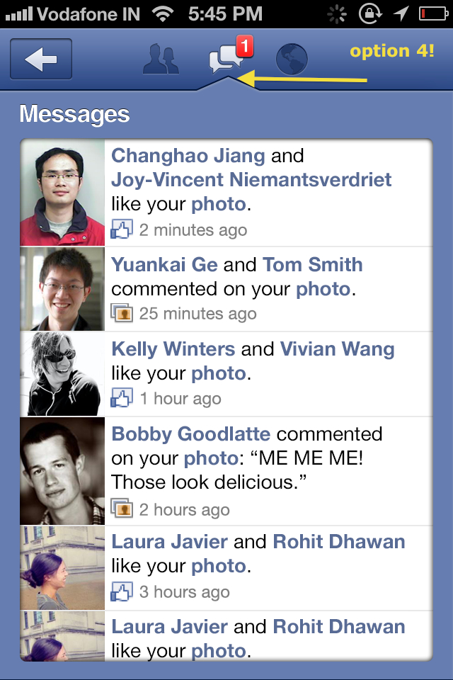
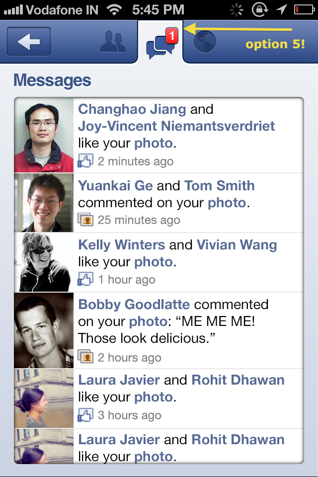
Check out the pokey, horrible ‘spear’ that appears in the notification tab:
It hurts, doesn’t it??
These are the Games2win Art team’s suggestions!!
Option 1 – A slightly milder, integrated ‘poke’?
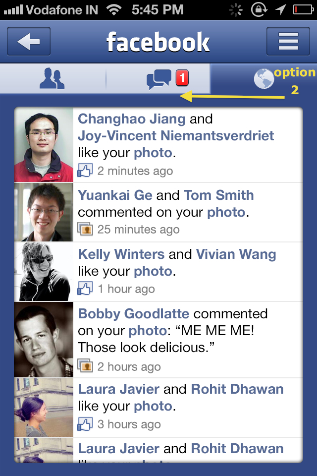
Option 2 – Why ‘poke’ at all?!
Option 3 – Blended, synced tab
Option 4- Pokey, pokey but not so hurty hurty..
And one last one!
Facebook, can you please get your act together and delight your presence on the ‘i’ platform a bit more?
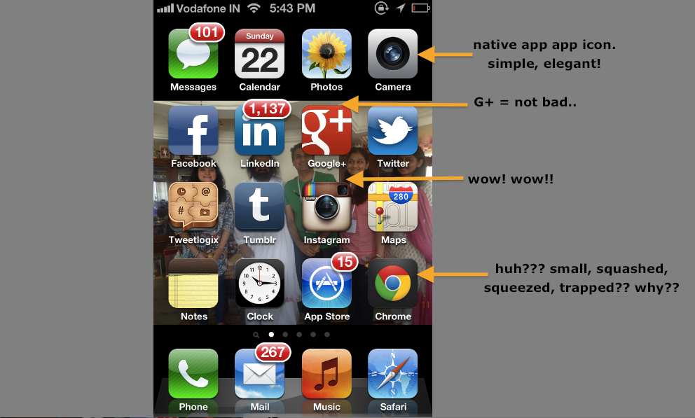
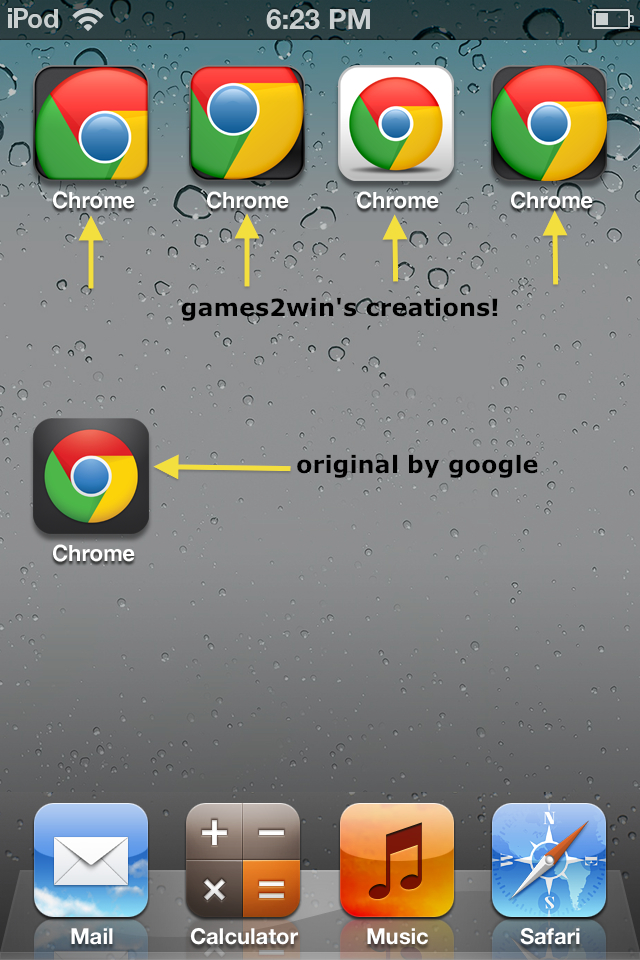
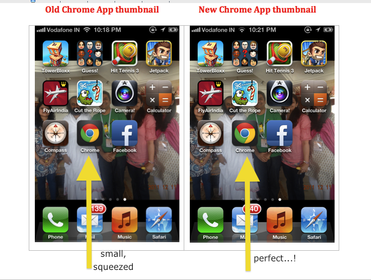
2. Google’s horrible, small, squashed ‘Chrome’ logo on iTunes 🙁
Check out the wow Instagram app icon, the beautiful native Apple app icons and then the squashed, compressed, squeezed Chrome app – set in a black/grey background?
Google, why have such a beautiful logo ‘coffined’ in a black box?
We at Games2win couldn’t hold back and decided to give the Chrome thumbnail a run for its money!!
Check out the options we created:
Google, you may not concur, but please peep beyond the Android mayhem. There is some beauty in the world…
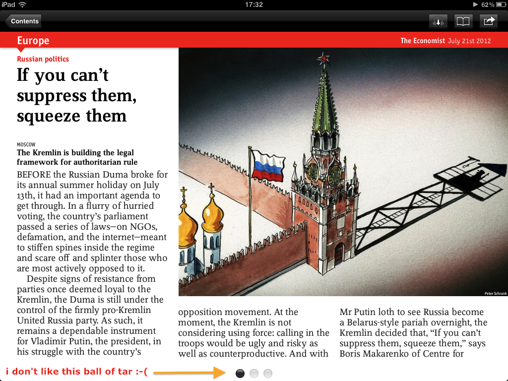
3. The Economist – ‘Tar’ black balls as paginators on the iPad app
:-((((
I swear by The Economist. I live by The Economist. Probably I will die with a copy of The Economist by my side.
But when I see these dark, ugly, ‘tar’ like droplets on the iPad pages (intended to mark page numbers), I throw up 🙁
My attention is focussed on these terrifically ugly ‘tarlets’ rather than the article I am reading 🙁
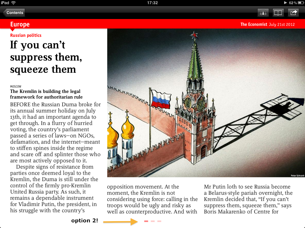
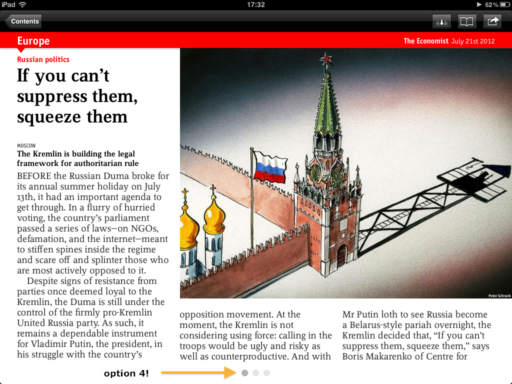
The Economist – I have some options to present to you, your highness!
Option 1 – Balls all right, but softer, red ones?!
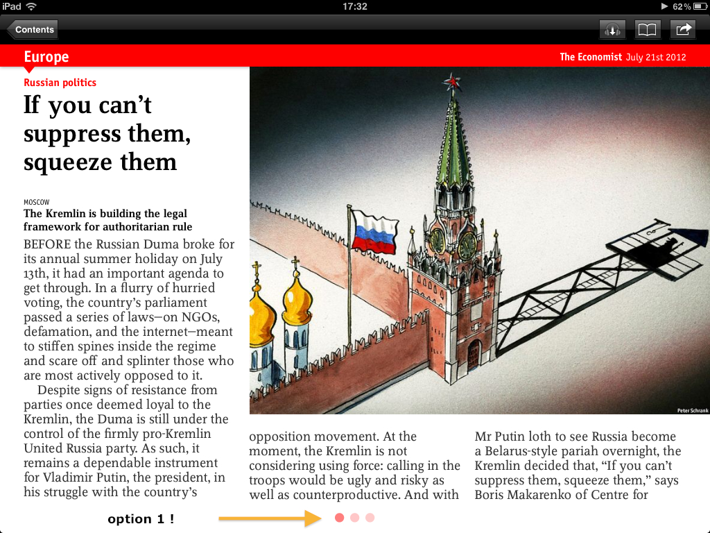 How about an Option 2 – dashes! use ’em!
Check out this option – dash with panache!
Hmmmm, a final one – grey, dull, balls.
The Economist – please give your design a re-look? Please?
Great design is not great art or great science. It’s a lethal combination of both. And no one gets it. It’s subjective, objective and very very personal.
Having said so, apps are what make the world go round, and if you are going to be in the business of delighting people, then you better start paying attention to what you put out there for people like me to tap on.
If it’s bad, then that tap just might get missed or skipped.
***
Major, major thanks to:
– Purtata Lew – Art Head of Games2win
– Sumesh Pillai – Art lead at Games2win
– Amol Medarkar – Illustrator at Games2win!
Tip – Don’t try hiring these folks. They love the torture I give them at Games2win
:-))
***
I will send this blog to some senior folks known to me at Facebook, Google and The Economist. Let’s see if they have something to say!
****
Finally – what do YOU think? Comment and let us all know!!
*******
Important note (posted later)
This is a post written by Alok Kejriwal in his personal capacity and not as the CEO of games2win (g2w). In his capacity as CEO of games2win, Alok and the Company acknowledge that g2w is NOT at all the gold standard for Art, UI or UX!
In fact in may of the g2w Company blogs, Alok has personally cried out loud about the terrible art that the Company (g2w) has and its attempt to improve it!
This is a humble, harmless post written by someone obsessed by detail and design and who is personally trying to improve what he may see. This is NOT a chest thump to claim that ‘we know it all’. In fact, we know nothing!!
*****
Feedback received so far:
Yipeee!
Check out some of the responses / reactions to this!
August 3, 2012 at 8:20pm
Hi Alok,
*****






Gurpreet Singh Tikku
God is in Details….
Good Points and Great Efforts by your team.
Reminds me of Steve Jobs calling Google’s Vic Gundotra, because he didn’t like the Google Icon on the iPhone and had a Solution Already in Place for him.
https://www.macrumors.com/2011/08/25/steve-jobs-called-googles-vic-gundotra-on-a-sunday-about-this-icon/
brijesht
Well pointed out details and better renditions – design is a personal and subjective choice ( as mentioned) but it always shows when there has been deep delving into the minutest of the details — as usually is with apple.
Just a small grammar-nazi kind of point, it should be Jobs’ (Possessive of Jobs, Steve Jobs)
Govind Kabade
Good Points made for FB, but for Google chrome not agree, the original one looks good rather than the new suggestions by your team,
Harshad Ghodke
Design is the last thing I would consider spending time on. A regular drinker of Black Label whisky won’t really care on how the bottle looks… Its the brand. Be best at what you are giving and things like design will matter least. Look at sites like Craigslist and Reddit… poor/no design whatsoever but still they are used by millions.
Ajay Pal Singh
I read a blog in HBR which tells the first wave of entrepreneurs was a technical person plus a business person. But second (current) wave is a developer plus a designer. When u see companies like IDEO, design makes u say WOW. I also feel FB app needs a complete overhaul, design and backed both. But design makes good tech awesome.
Ankur Sharma
I actually like the original designs better in all the above cases. The only two sensible designs from G2W team are ‘Option 3’ for ‘Chrome’ and ‘Option 4’ for ‘The Economist’
Mahesh Khambadkone
All three are popular and great products despite these UI chinks.
Having said that, the Google icon changes will make the most difference.
brijesht
It matters to the creator and subsequently when the consumer sees the detailing (if at all they do), to them as well. Needless to say, the functionality has to be there, you can’t sell a dysfunctional, beautiful product.
As for craigslist, reddit – i really don’t think the point here is that to be used by millions, you need excellent design – point is it can be made better.
Every small detail tells a story & gets you to that ‘wow, they thought about that too’ – it’s kind of vague, inexplainable and hard to reason out how that matters (read – how is it going to get your business more money)
To me, it does really matter, perhaps yes, the last thing to do – but I guess all the above suggestions (though I really don’t agree with the economist one) are something that can be worked upon and made better.
Zingo Desouza
Agreed .. bad design sucks.
But seriously, have you ever looked critically at g2w apps?
Have attached a sample pic, why would parking frenzy not allow touch gestures but force me to use some shitty control?
I remember another horrific kill osama game from g2w .. hope you remember too ..
I mean wouldn’t it be better use of your and g2w design team’s time to work on your own apps first before telling the world how other people’s design sucks?
I also seriously hope that when you say design you mean user experience design and not just fancy UI design (colors and fonts).
Ramnath Banerjee
Really good pointers, loved reading it! Let me put in my 2 cents…
In regards to the Facebook notifications, I believe the awesome FB Design team also need to relook at the formatting of the notification content delivered to the users.
Option 1: Since the notification already displays the friend(s) name(s) who have liked/commented on a photo (as in the snapshot), why can’t it display the photo which has been liked/commented instead of displaying the DP? Doing so will make the notification more informative and will make everyone’s life easy since you won’t need to click on the ‘photo’ link time and again to check which photo are they liking/commenting. (DAMN, will that reduce visitor loyalty? Nops I guess.)
Option 2: If more than 1 friend likes/comments on a photo, display upto 4 DPs (instead of 1 as we see in the browser based notifications).
In regards to the Chrome icon, the suggested ones are nicer! However, I still get a feeling that the existing Chrome icon (with lots of white pace around it) has been intentionally designed to give it an uncharacteristic look and in the process help the users locate it easily. Isn’t the dashboard looking too crowdy with all the big icons, notifications, etc.?
Mahesh Khambadkone
My point exactly – despite the design ‘flaws’ you point out, players loved the experience of both games.
Going by the examples Alok prepared, I’m pretty sure it’s more UI than UX / design.
Zingo Desouza
So is the contention that the ghost of ‘steve jobs’ only influence UI decisions .. and forgot to mention how apple devices revolutionalized UX?I feel for the ghost turning in grave..
Inspite of the UI ‘flows’ you guys mentioned users love FB,Economist and Chrome apps .. and if I may say users use these apps more than ‘parking frenzy’.
More to think why product itself needs to be better designed and needs to have richer offering to users than worrying sick about colors?
Mahesh Khambadkone
Cough cough. Even Steve Jobs worried sick about colours and line width : https://eggfreckles.net/notes/apples-history-of-skeuomorphism/
Zingo Desouza
Correct. No one is saying UI is not important. My only two points
1. G2W needs to focus more on it’s own UI and UX especially before prioritizing redesigning of other apps UI by it’s own designers.It has a typical undercooked look which is putting users off. (Pls don’t throw parking frenzy statistics in my face since I can then throw back fb app statistics and usage figures in your face.)
2. UX needs to be fixed before you venture in UI (visual design). Both are very important but just UI design does not help when you have bad UX (e.g. Parking Frenzy and Kill Osama BTW I think both these apps also had a very very bad visual design)
Your argument to these points reminds me of a famous marathi saying ..:-)
(check with your marathi friends if you don’t know what this means)
“गाढवा पुढे वाचली गीता .. कालचा गोंधळ बरा होता” ..:-)
Peace out.
Mahesh Khambadkone
But this post is not even about Parking Frenzy or G2W. You keep bringing them up in your replies.
It’s about 3 huge, popular brands and what they could do to improve design artifacts that are most in-the-face.
Nidhi Kukreja
Very well said by a designer that “ A good design is transparent” .
So how can u be poky in “ I-World”
Simply loved the option 2 for chrome as right corner treatment adds on a new perspective
Option 4 for facebook and ET every well integrated in design , simply effective .
Even Google + needs a makeover =)
Aditya Reddy
I totally agree with you.
Phil S
Cough Cough….Well, Mahesh – this post IS ABOUT ‘Bad design sucks’….even if it is on G2W and Parking Frenzy…….and even more when it’s from Big Brands. (well, if you think G2W/Parking Frenzy is a small brand, then it’s a different story altogether).
I personally believe that FB is one of the few tech companies that really GET DESIGN. ( https://www.fastcodesign.com/1669445/how-facebook-finds-the-best-des…). More so, I do have a bit of design experience and I find nothing wrong with that FB notification design and it is quite consistent with what we see on their main website. One can say, it’s a design call of facebook. You can have ur own opinion..
While, I also feel that Chrome iOS logo is kind of a downer and did like one of the options G2W designers have given, but I find Alok’s initial comments quite awkward.
@Alok – I like most of your writing, but this one, in my opinion, was a bit snobbish and felt weirdly awkward when you wrote, ‘It signals to me that these brands don’t respect the ‘i’ universe. They don’t ‘get it’. Really???
Well I am assuming that you get it, but honestly, I don’t think G2W games are any design marvels. I am sure you’d agree to that. I am saying this, from the POV that you represent G2W…..
Mahes might think, why am I bringing G2W into the picture. I am, because – you made Parking Frenzy – the first Indian Game to have made a global mark. Come on man – YOU GUYS ARE A BIG BRAND NOW (In India, ofcourse) ….and quite literally you guys suck at design (So far)….. I don’t see any reason why you should ???
Just like how you think, “It really hurts my eyes, my sensibilities and my heart when the biggest brands in the world do a shabby job in the holy world of ‘i’ art.” — Did you ever consider that it pains your users eyes too…about you work?
Well, I sure hope that future games that we see from G2W, are as grandiose as the design sensibilities you seem to be having…let’s see
~ and yeah, I agree with Zingo Desouza‘s comment above. I don’t know Marathi…but I got what this means… ‘“गाढवा पुढे वाचली गीता .. कालचा गोंधळ बरा होता” ..:-)’…. So True…
~ Phil.
Mahesh Khambadkone
Thank you for bracketing G2W with the likes of Facebook, The Economist and Google 🙂 We’ll strive hard to ensure our games have got great aesthetics.
So, back to the post : do you think big brands needs to worry about these UI artifacts. I don’t think so ; see my first reply.
Alok Rodinhood Kejriwal
cough, cough, sputter, sputter, cough!
This post is written by the CEO of games2win in his personal capacity. The Company Games2win is in desperate search of ‘art, ui, ux nirvana’ as clearly outspoken on our company’s blogs.
games2win is striving hard to delight and uses the big boys as its inspiration.
I never knew it was a crime to learn and recommend at the same time, but it seems it is, via these remarks!
I do know one thing though – FB, Google and The Economist will not scoff at games2win and say ‘hahahaha – hey you cockroaches – look at your shitty apps… look who is talking…’ That is a very Indian, condescending attitude..
THE GREATNESS of FB, Google and The Economist is that they accept feedback.
And in that humility, we do too!!!
So, as the games2win ceo let me once again publicly acknowledge that we are bad in design, bad in UI, bad in UX, bad in (fill in the blanks)
BUT WE ARE TRYING, and demonstrating this by ways and means of new apps, updates and small pranky examples like this post (using time borrowed from g2w designers just for this personal post).
Personally, as a CEO, I think our designers deserve to have a bit of fun here and there and not just be focussed like a moronic company on ONLY doing its own stuff every minute. Thats SLAVERY.
Long story short – thank you for (as usual) pointing out how small and worthless we are. While I will not bother about the Marathi, I will post a note of humility just now as part of the post so that no one is confused about the greatness in art we seem to have claimed!!
Alok Rodinhood Kejriwal
Thanks Phil and Zingo for inspiring me to post this just at the end of the post (errr – its in English… A marathi translation could help)
Important note (posted later)
This is a post written by Alok Kejriwal in his personal capacity and not as the CEO of games2win (g2w). In his capacity as CEO of games2win, Alok and the Company acknowledge that g2w is NOT at all the gold standard for Art, UI or UX!
In fact in may of the g2w Company blogs, Alok has personally cried out loud about the terrible art that the Company (g2w) has and its attempt to improve it!
This is a humble, harmless post written by someone obsessed by detail and design and who is personally trying to improve what he may see. This is NOT a chest thump to claim that ‘we know it all’. In fact, we know nothing!!
*****
Phil S
Coming to Mahesh’s question: “do you think big brands needs to worry about these UI artifacts”
And lastly, In my opinion – it has nothing to do with big brands, small brands. Any brand that’s worth its salt, will have to think about Design. It’s a choice actually. A simple choice between ‘Commitment’ and ‘Commodity’. And the irony is, there’s market for both. Your choice.
Zingo Desouza
Hats off to you ,Alok and Mahesh to clarifying the air and being so humble about it.
As Phil mentioned, I too found your initial post snobbish considering the bad designs of g2w but now as you mention it, you are right. There absolutely no problem in commenting on others while you are at improving yourselves.
for me, personally, Indian or otherwise this ‘disclaimer’ in the post itself would have saved some irritable moments.
asha chaudhry
thanks for pointing the typo out brijesht – i was sitting at the g2w office for the first time in my life while cleaning up this piece and was kinda overwhelmed :)))))))))))
shall correct asap!
Alok Rodinhood Kejriwal
Yipeee!!
Check this response received!!!
Gurpreet Singh Tikku
Baat Karne se Baat Banti Hai!!
Nishant Agrawal
Agree with every word.
Nishant Agrawal
Well, yes, no harm suggesting others when your own work sucks big time and you acknowledge the same. But then, as you said, design is subjective. I find the original work by FB way better than the suggestions by g2w. For the Chrome logo, g2w’s suggestions are more effective. Can’t comment
Coming back home, g2w needs a design overhaul. Haven’t played the games, but the site lags a decade behind in design. Therodinhoods.com – more so. It’s an eyesore. I wish the design would catch up with its functional usefulness.
Alok Rodinhood Kejriwal
thanks for the suggestions. maybe you have some ideas?
Nishant Agrawal
Eh, well, a few months ago I did message you over a dozen suggestions as a private message on therodinhoods.wpengine.com.
Anyways, here they are:
1. The layout is a bit messy. Things are hard to find.
2. The ‘Members’ panel on the home page (left-hand side) serves little purpose.
3. The logo isn’t particularly appealing. And the ‘Thinkers. Doers’ has an awkward layout.
4. The main navigation bar is very cluttered up. It can be trimmed:
a. ‘Home’ button isn’t required. The logo serves the same purpose.
b. ‘My Page’ isn’t needed. Clicking on one’s name on the top-most bar serves the same function – and people are more used to that. Also, the hover style for one’s name needs to be changed.
c. ‘Members’: redundant.
d. ‘Wall of Fame’ serves little purpose. And anyways I was expecting something different from ‘Wall of Fame’.
e. ‘Invite’: I would put it somewhere else; same with ‘About’.
and so on …
5. When I received your message, I didn’t get an email notification. Is that default?
6. There’s a lot of stuff being downloaded from Facebook CDN. Social connect is good, but too much doesn’t look ‘sophisticated’; it reeks of desperation. And this stuff consumes a hell lot of bandwidth. Your homepage is 1.1 MB in size!
7. The black background for headings and sub-headings doesn’t stand out.
8. I don’t understand why you added the feature to customize profile pages. It’s out of sync with the ‘soul’ of rest of the site, although I feel that many people would use it. The stark design changes I see when looking around at profiles doesn’t make me very comfy.
9. Why not use ajax to load photos when browsing through an album. Right now, to see each photo, I have to wait for the page to reload, and then scroll down. Frustrating.
10. I don’t understand what purpose the ‘Birthdays’ panel on the homepage serves.
What is dislike most is the amateurish use of css on the whole site. The site is almost like a vehement protest against Web 2.0 design.
You can spend some time to think over this, or you can choose to ignore all these suggestions as silly rants coming from a person with no experience or formal training in coding / designing.
Alok Rodinhood Kejriwal
I use Ning.com . This is what comes with the platform. The site is to serve entrepreneurs with the ability of one man me to manage with a couple of clicks for anything like sending newsletters to deleting spammers etc. Sorry to disappoint you.
Rajarshi Chatterjee
Not sure about the facebook recommendations. The whole objective of this design is to keep it separate and hence “pokey”. I am not sure which version of the app you took screenshots from but you missed a button on the right of “Messages” where you can click and instantly compose a message – refer to my screenshots. I feel Facebook tries to separate messages from the rest of facebook and they made an app for it. Also you can drag the messages to the bottom to get an update for your inbox. This behavior is much more intuitive for a common user because this box is separated. If it seemed to be so blended in people wont do that.
Regarding the chrome icons – I feel the current one is much more sharp and clean – in line with google’s design philosophy. We don’t need an icon popping out and shadows inside an icon.
Ramnath Banerjee
YESSS!!!
Facebook have implemented Option 1 (as above):
Option 1: Since the notification already displays the friend(s) name(s) who have liked/commented on a photo (as in the snapshot), why can’t it display the photo which has been liked/commented instead of displaying the DP? Doing so will make the notification more informative and will make everyone’s life easy since you won’t need to click on the ‘photo’ link time and again to check which photo are they liking/commenting. (DAMN, will that reduce visitor loyalty? Nops I guess.)
#WinWinWin
Ramnath Banerjee
Win!!! Delighted to see Facebook implementing my first suggestion! Please check my comments above…
Alok Rodinhood Kejriwal
WOW – what do u do? Would u consider a job with 2win???
alok@rodinhood.com
Ramnath Banerjee
A BIG THANKS TO YOU FOR STARTING THE THREAD 🙂
Will mail you shortly.
Alok Rodinhood Kejriwal
30th august – 2012
Sujay Pawar
Nice One Alok.
Just one note – You are showing “Notifications” under “Messages” in your suggestion to Facebook App. Aren’t we talking attention to details here?
😉
Alok Rodinhood Kejriwal
🙂
GREAT point!
I meant the ‘notification’ of the message :-))