For a mobile app developer, one of the premier infrastructure that defines success is how well you are building a relationship with your customer that’s based on trust, worth of daily usage and relevant content. We want the app to make users well engaged; and Push Notifications are among the most effective tools you can use to engage your audience. But, one must also agree that if not used effectively, they can be your own worst enemy. Many app developers and companies follow several strategies to send notifications, which could be based on Target Groups, Behavioural Patterns, Geo Pattern/Geo Alerts, Locale targeting or any other pattern designed as per app strategy.
Every single app these days is pushing a bunch of notifications every single day. As small as 10-15% of notifications could actually be termed as ‘Smart Notifications’ which are clicked. Some of them might be relevant or worthless or even annoying – all of these cases contribute largely to the step of uninstalling the app.
Push notifications are irritating, but if used smartly, it can be used as an engagement booster.
Let’s take a recent case of my experience with Myntra App. I’ve been a fan of the Myntra app and love the way they send notifications. After following their pattern of notifications quite deeply, I have some interesting observations of their notification strategy:
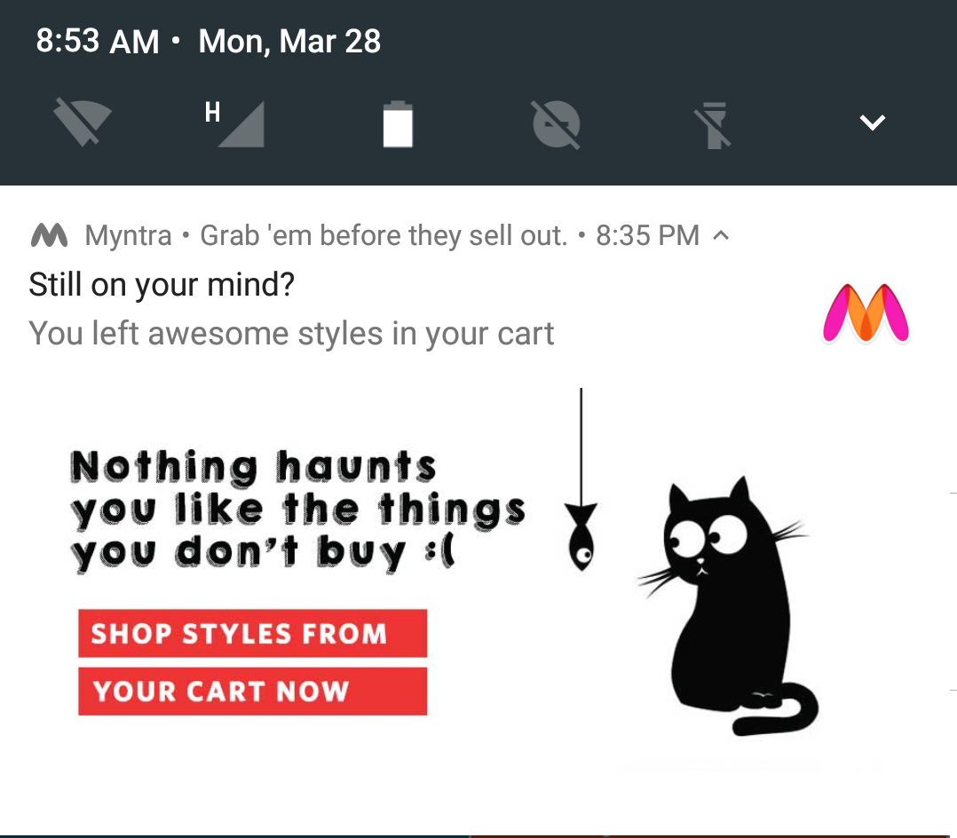
During one of the recent offer-days on Myntra, I added several products to the cart but didn’t check out. I waited for a while until I received a notification.
I was kind of impressed with this notification as it aimed to remind me that I have products in the cart and they wanted me to get into the app, probably to add some more products or to check out. The best part of this notification was, it was pushed at the time when Myntra was running an exclusive sale of 40-60% on several of its products in different product themes.
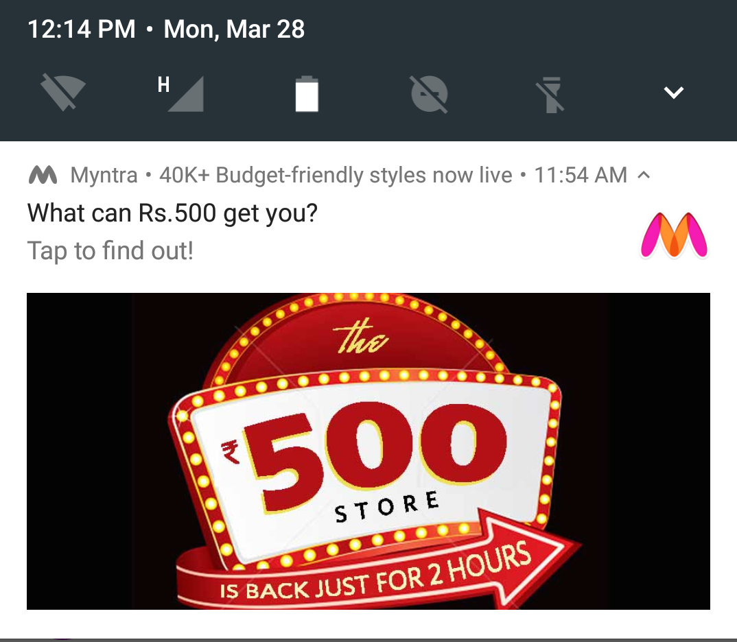
Having dismissed this notification, Myntra sent a series of notifications at a particular time, showing off the list of offers going on. First one at 12.14PM on the same day, highlighting what Rs.500/- can get me from Myntra. They used a catchy line and image. I didn’t click the notification this time too.
Notifications should be so tempting that they make users use the app right away
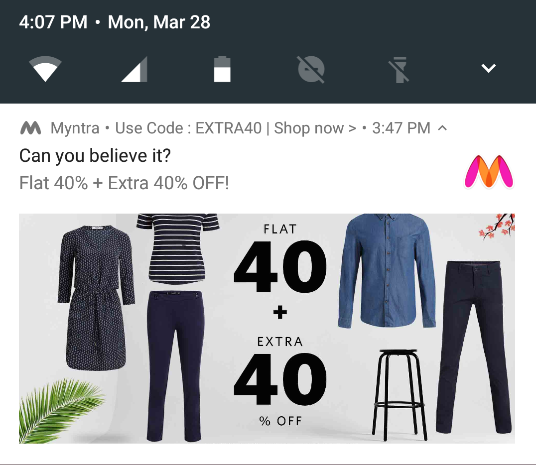
..and another one followed at 4.07PM. Again, I was impressed with the notification line and image. Just like before, I dismissed this notification too.
The show continued and I realized that I had one more notification at 4.14 PM (around 7 mins later from previous notification). This to me, highlights one of the basic rules that can be incorporated in an app.
Understand user behaviour. If I am dismissing Myntra notifications 4 out of 4 times, why not mute it for me automatically?
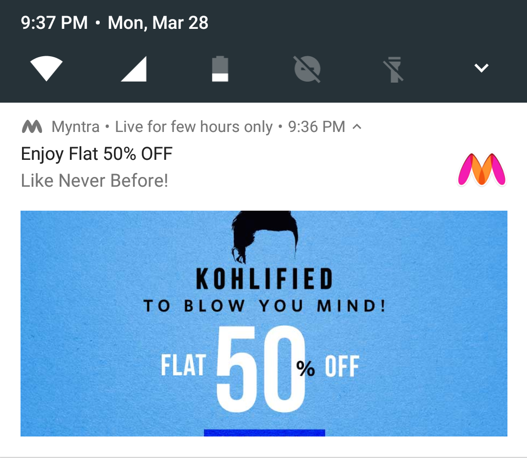
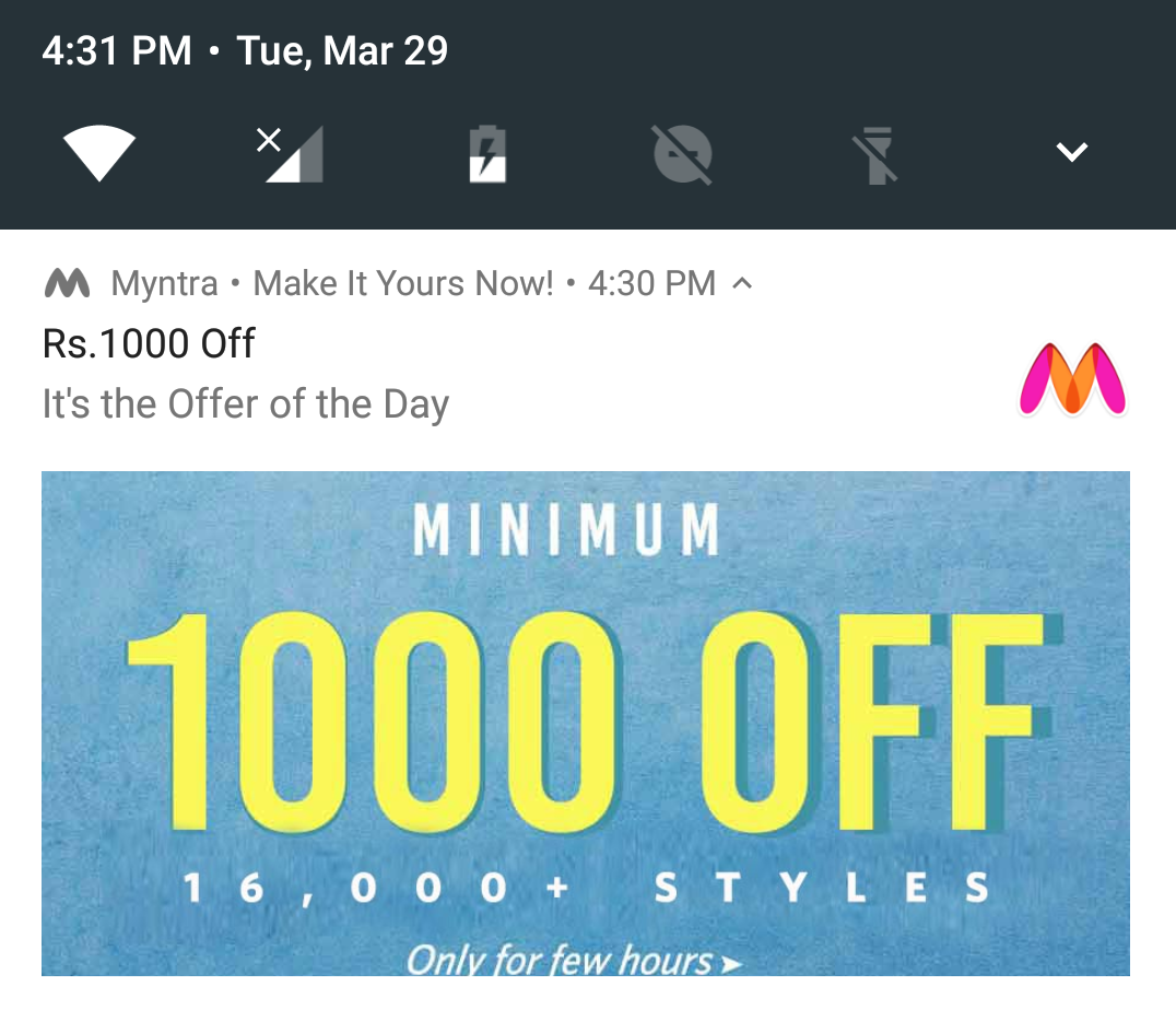
The story continued several times, until 9.37 PM when I received my last notification. All of which, I dismissed. This is something Myntra could automate to understand on basis of User Behaviour than frequently sending across notifications. What impressed me was the imagery and the way notifications were defined. Bang on. If you check the color schemes used in the notifications in the day v/s night, it would resemble the reasoning of the color theory of notifications.
One other point that caught my attention was how Myntra sent me notifications based on Timings. On the previous day i.e 28th March, I was pretty much active reading the news content for a long hours. The app sends out a notification on 29th March around the same time when I was active the previous day. Interesting.
Push notifications at the right time when you feel users are likely to click
For e.g. If your’s is a Location Discovery App, and user is finding pizza places around, send a user X % off coupon of a place. Might help them save a few bucks. Even better, find how much time he’s spent searching for Pizza places, and then send him coupons. This might nudge him to stop at a pizza joint! In a nutshell, give notifications a smarter understanding of the user’s behaviour.
Stay tuned for the next article that will provide insights on how app notifications can be made more engaging.
Disclaimer: This article is purely based on a personal experience (and experiment) on how Myntra’s notifications can be improved. I am not associated with the company but am still a fan of the Myntra app 🙂
Do get in touch with me on Twitter ( @prajyotm) and Facebook (/Prajyotmainkar)




asha chaudhry
prajyot – i love the keeda in your mind. how you constantly try to improve UX/CX in every form possible!! that pizza coupon example of making notifications smarter to understand the user’s behaviour better just killed it!!
what a lovely gift YOU have given US on your b’day!! have an awesome day 🙂
asha chaudhry
ps: the cat and fish image is really neat 🙂 so clearly they are doing something right (and clearly i don’t buy anything via app!!!) 🙂
Anirudh B Balotiaa
Notifications…the thing which we all hate and like at times. The thing due to which we are increasingly getting more distracted which each passing day.
Except News snippets, meeting requests, emails, whatsapp, facebook, twitter, linkedin….I hate all other notifications such as for Shopping/Food/Movies for the very reason you mentioned that they are dumb.
Dumb notification implementation in a smartphone, quite ironic eh.
Whats glaringly missing is that apps dont provide the option to customize notifications, for example yesterday (match-day) from the time Pizza Hut opens, I got notifications every hour for their offers. End result? I deleted the app. Yes I could have turned off the notifications, but then they spammed me too much and I felt totally off.
Myntra, Snapdeal, Amazon, Snapdeal…when one installs all Notifications are activated by default, but then within a day or so with their incessant alerts, one invariably wants to turn the damn thing off.
There is a LOT of smartness yet to be discovered as far as Notifications are concerned. Its way too badly implemented at present.
Looking forward to the following post(s) on these.
Prajyot Mainkar
Firstly, thanks for the views. You are right, notifications are, these days used as spam. Kinda like AutoBots. Even in the case of Myntra, there were a lot of notifications ( just as i type, i got one from them..) that arrived, frequently, one after other. Sometimes you feel that developers should use this technique to learn from user than spamming them. Or else, “uninstall” is the way 🙂
Prajyot Mainkar
Thanks for the wishes and comments 🙂 Always happy to share my views on TRH 🙂
Alok Rodinhood Kejriwal
Excellent write up! We at games2win use notifications very feebly – have passed this blog internally to the teams!
ps – do u consult on this also?
Prajyot Mainkar
Thank you Alok. Glad you liked the article and shared it with your team 🙂 Regarding the consultancy, i do consultancy on the app analytics.
asha chaudhry
hey prajyot – i just read an interesting piece on notifications!
https://www.niemanlab.org/2015/12/notifications-that-know-me/