I’m bewildered why Companies try and FIX things that ARE NOT broken…
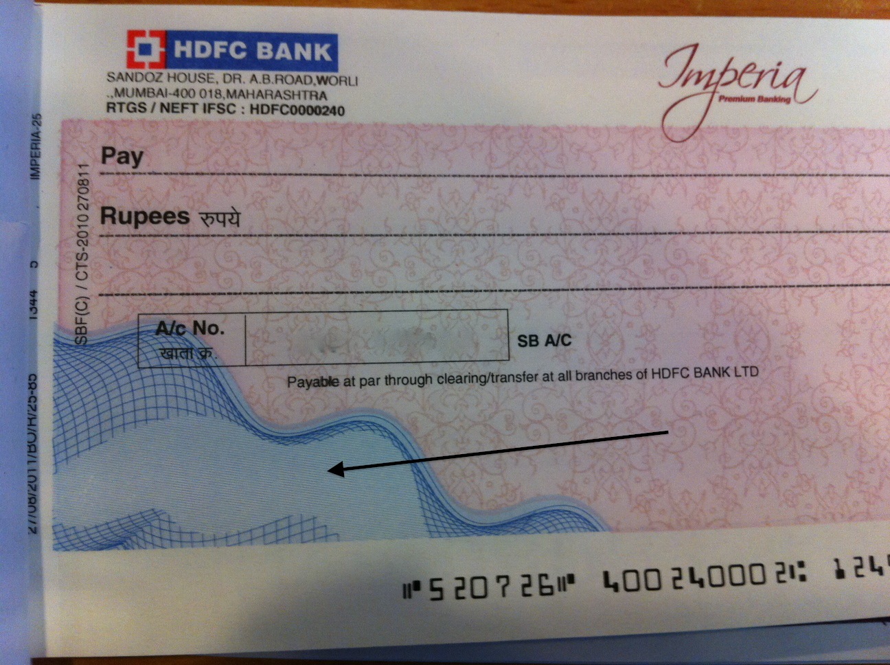
Look at the NEW CHEQUE design that HDFC Bank sent me in a new Cheque Book:
Now, WHY and pray tell me WHY would HDFC Bank create this blue color Tidal Wave Tsunami Design and RUIN my cheque writing experience…
I hope they realize that writing a cheque is also an experience and should be respected?
WHY?
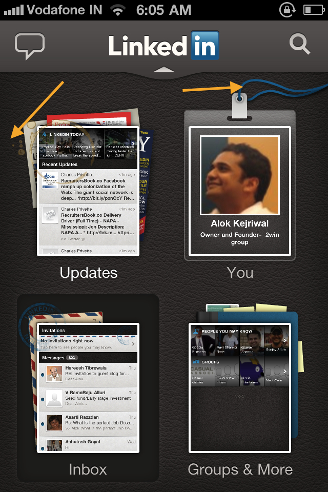
Look at how Linkedin revamped its own iPhone App:
Why have COFFEE STAINS and BLUE RIBBONS APPEARED all over the app??
The original cheque of HDFC and the original app of Linkedin were fine. WHY DID THEY FIX WHAT IS NOT BROKE?
What motivates Companies to constantly meddle with their happy running business and mess with its consumers??
My belief:
– Change in senior management roles
As the old dictat goes – the new guy just is NEVER happy with what his predecessor left behind. There is always this fetish to CHANGE and MAKE NEW the department just to appease the new kid in town
– Copy Catting.
SO WHAT if the Linkedin app look old and fuddy duddy? That’s what its supposed to be – I’m not using Linkedin to learn about art but to connect to people.
BUT
There is always this pressure to become smarter, faster, slicker, COOLER than the competition or ‘assumed’ competition and make what’s looking fine – HORRIBLE
What these Companies don’t realize is that its very possible that lots of the Companies they are benchmarking themselves to or ‘copying’ are rectifing mistakes and defective business models – not neccessarily improving – hence there is NO NEED to force change on themselves!
– The fashion of CHANGE
‘Man, we gotta keep up with change’. How cliched is that??
I think organisations need to PROVE A POINT that they are tackling CHANGE – BY CHANGING!
They actively engage themselves and their people and their resources to CHANGE – SOMETHING and that eventually leads to changing ANYTHING…
– GREEDY CONSULTANTS
Very typical of the advertising fraternity – Fat slobs walk around the world and tell Brand Owners that their LOGO sucks. That the logo looks like its from the ’90’s’. That it needs change…
Hahaha = When did you see Coke or Colgate change its logo?
If anything needs change its the PRODUCT not the presentation.
But Silver Foxes who run these Brands feel intimidated and then resort to changing something that never needed fixing!
– New, Young Owners
Every handover of a business from the old generation to the new generation involves young people taking over. They are ADEPT at FIXING what Ain’t broke.
I think that’s because they don’t have the imagination and the vision to do anything productive and just spotting what seems outdated or old fashioned becomes an EARLY PREY for them.
Its also a nice exercise in ‘Corporate Rebellion’
I guess its only through experience one learns the immortal lesson that ‘OLD IS GOLD’
******
Please share examples of unnecessary change in
your organisation and of things and businesses you have seen around you


kinnari thacker dave
the new FB look ..errrrrrr.
Aditya Babbar
Alok, the arty-farty cheques by HDFC are a take from what banks in the US used to do. You can/could order Customised Cheque Books with cartoon characters, tsunami designs … All in all, an effort to customise your cheque, but still a very frivolous expense (mind you they would charge for that).
You see all things ‘new’ and ‘updated’ and you wonder why o why would you mess with what worked well. K.I.S.S right !?
Facebook prime example, why is White Space such a bad thing. I mean why the need to clog things into all parts of the screen.
Saurabh Jain
I think Pepsi’s older tag lines were so good. I do not remember their last 4-5 tag lines. But everybody remembers Oye Bubbly, It’s the right choice baby aha etc. I still do not know why they changed those tag lines in just 1 year.
Piyush Jain
Dear Alok
I attribute this to greedy consultants, who via their fancy presentations, convince the management for such unnecessary changes. Though the consumers are completely unaware of the deeper thought behind them, the management feels we would understand them one day. I have been using LinkedIn for iPhone for quite some time and really not in favour of the new app design.
Piyush
+91 9686 939 119
Send a Gift today
Rakesh Sidana
For HDFC, i think they may be trying to put something for security reason (like opaqueness with some watermark) i can not see reason for LinkedIn.
/Rakesh
Alok Rodinhood Kejriwal
Checked. It’s only decoration !!