Hi Fellow Rodinhooders,
My name is Neeraj and for people who are not familiar with me here..I am one of the co-founders of RockYourPaper. RockYourPaper is a platform for students and researchers to discover, manage and publish relevant research articles in an affordable and transparent way.
Over the time RockYourPaper became the defacto search engine for searching and managing “Open Access” research articles. Today more than 200,000 registered users uses this platform to discover and manage the research articles.
As RockYourPaper grows with it’s user base steadily, focus now shifts to new product development. Since our users are mostly students, researchers and institutions. It is only logical for us to look into something which is more academic oriented and and also keeps with RockYourPaper’s philosophy of making knowledge affordable. We are now working to make organizing conferences a cake walk.
Our first priority was to come up with a name. Name is “INKOMFA” which means “Conference” in Zulu language. INKOMFA is an online system to organize and manage “Academic” conferences. Once settled with the name and the other details, we started working on the logo. Our designer has suggested few options. We want to put it in the public domain here and ask Rodinhooders for their feedback. We will be glad to get some feedback on the Logos and also if some of you can suggest a “tagline”
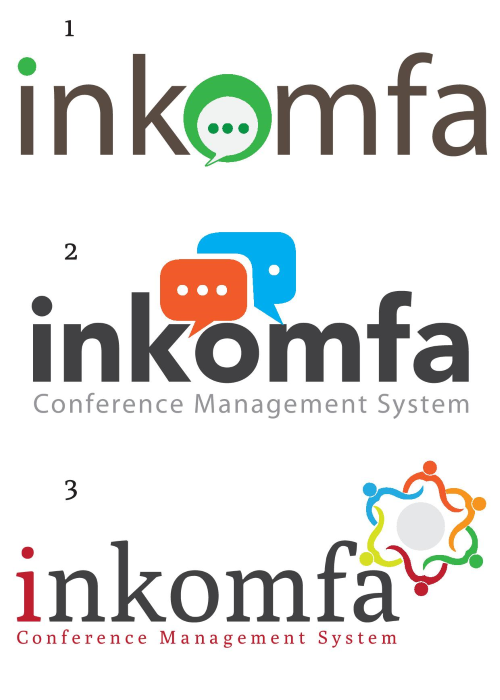
Here are the options. Let me know what you feel.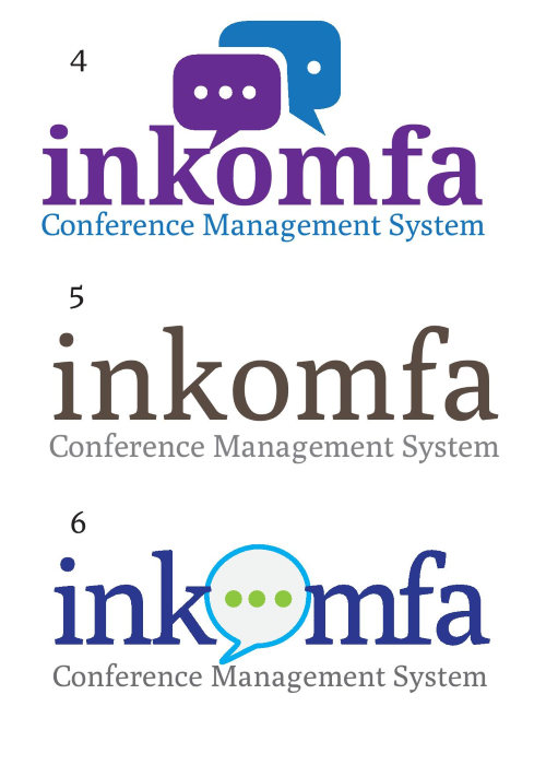
Thanks!





Ravi Kumar
Hi,
I like 2, 3 and 4 in that order. The name is a bit complicated though 🙂
Binit Naulakha
The 2nd Logo is the Best
Amit Shroff
Neeraj,
Excluding the points below, I liked 2, 4.
Quick Feedback!
Feedback on Logo :
Take a look at our brand guideline may be this could help – https://issuu.com/72interactive/docs/72interactive-brand
Other brand guideline that you can refer:
https://issuu.com/tafsirulalamtusar/docs/vitaxtrong_brand_guideline
https://issuu.com/borkymercadoperida/docs/khana_brand_guideline
https://issuu.com/jemueldatiles/docs/hmrebrandguideline
https://issuu.com/logobr/docs/carrefour_brand_book
Also consider reading this logo design guide book :
https://issuu.com/jaiminimistry/docs/final_guidelines
https://issuu.com/jamuss/docs/logo-design
https://issuu.com/koekje/docs/graphic-design-letterhead—logo
https://issuu.com/empty/docs/logo_design_workbook
I hope this helped…
Regards,
Amit
Neeraj Mehta
HI Everyone,
Thanks for the quick response. Amit, thank you very much for the details, will keep the points in mind while interacting with our AD.
Rodinhood rocks!
Neeraj
Abhik Prasad
Neeraj,
Before you finalize on the logo, I would urge you to take a relook at your name.
It may mean conference in Zulu but are you targeting zulu land 🙂
Inkomfa is not the easiest word to pronounce (Imagine yourself calling someone on the phone and saying, “Hi, I am from Inkomfa (in-kom-fa) vs “Hi, I am from Komfa…”
We learnt this the hard with our startup – Finqa
It’s short for Financial Questions Answered and we thought it was a pretty smart name and assumed people would pronounce it as Finca but a lot of folks have difficult pronouncing it (Finqua, Finkwa, etc etc is some of the ways they pronounce it and it almost becomes a tongue twister for them.
Yunus Dange
2
Amit Shroff
Welcome Neeraj!!
Amit Shroff
Yes I agree with Abhik the name should be simple to remember…so that one can easily recall..!!!