Hi everyone! Hope everyone is having a great Monday (ok no that’s an oxymoron, but we can all take solace in the fact that tomorrow is Republic Day!)
I’ve been active in this community over the last couple of months and really love the energy with which the members here approach things.
I’m going to take this opportunity to introduce a product that we are building – Cubeit
What is Cubeit:
Cubeit is a mobile application (Android for now, Web App coming soon) which converts any content you want to save into actionable cards.
(If you have used Google Now, you’ll be familiar with the concept of cards – Cards are individual pieces of information from a specific source)
But why cards? Because content is not actionable on mobile
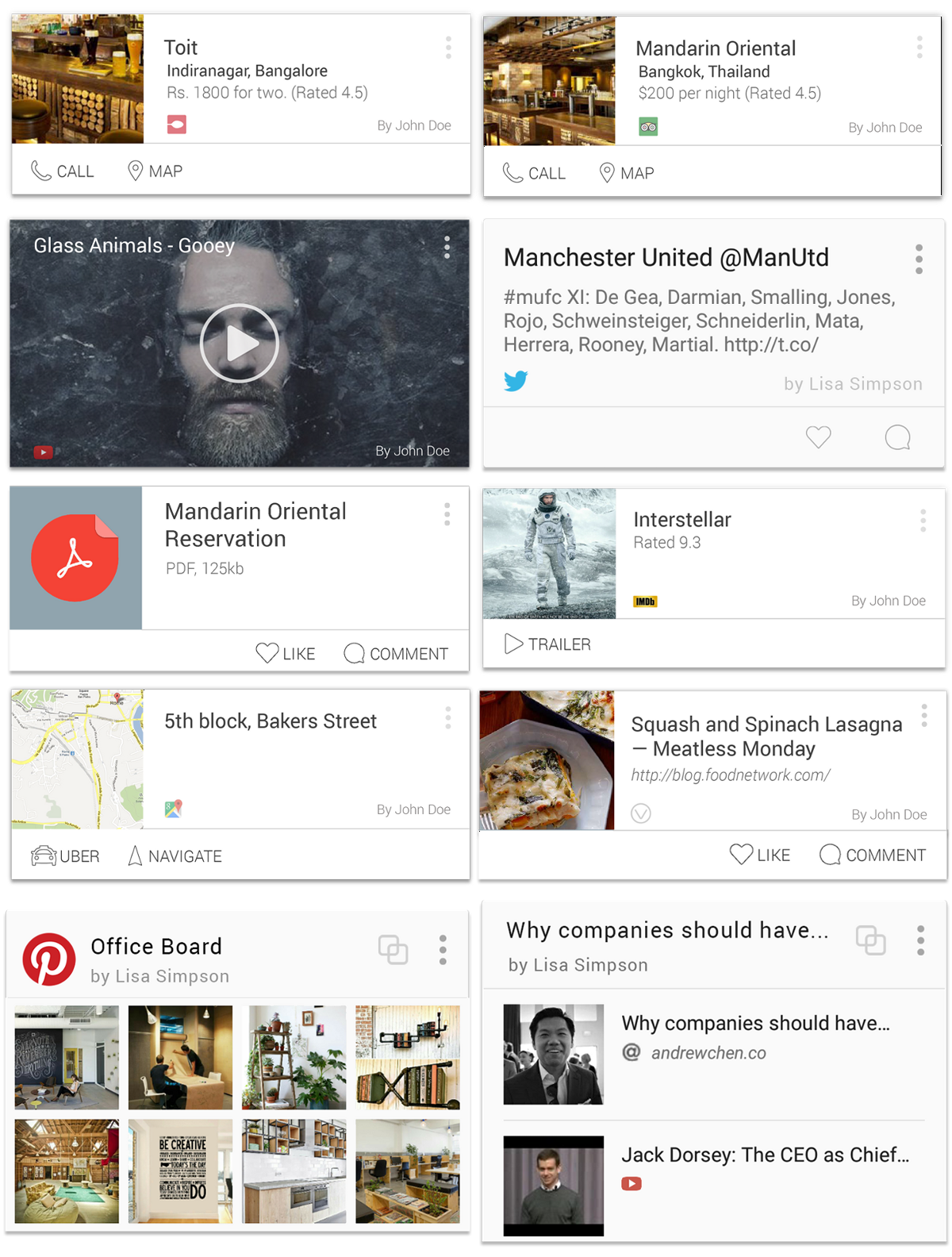
This is to solve a problem you all have experienced – whenever someone sends you a link/other content on mobile (chat/email), you think twice about opening it because it’s just too painful to switch between apps on the small screen, and links themselves tell you nothing about what is being shared (it’s just garbled text). Cards extract relevant information from the link and show it to you up front so you can immediately understand what someone has sent you. Here’s a collage of some of the cards we support right now. (We’re constantly iterating so you’ll see a slightly different version when you use the app)
Depending on the context, cards will have buttons which will let you take action from within the app – you can play a YouTube video, read an article, or call a restaurant – all by tapping on the card! It completely removes the hassle of switching between apps to view/use content.
And last but not the least – you can collect a set of cards in a collection (we call it a Cube) and share it with friends!
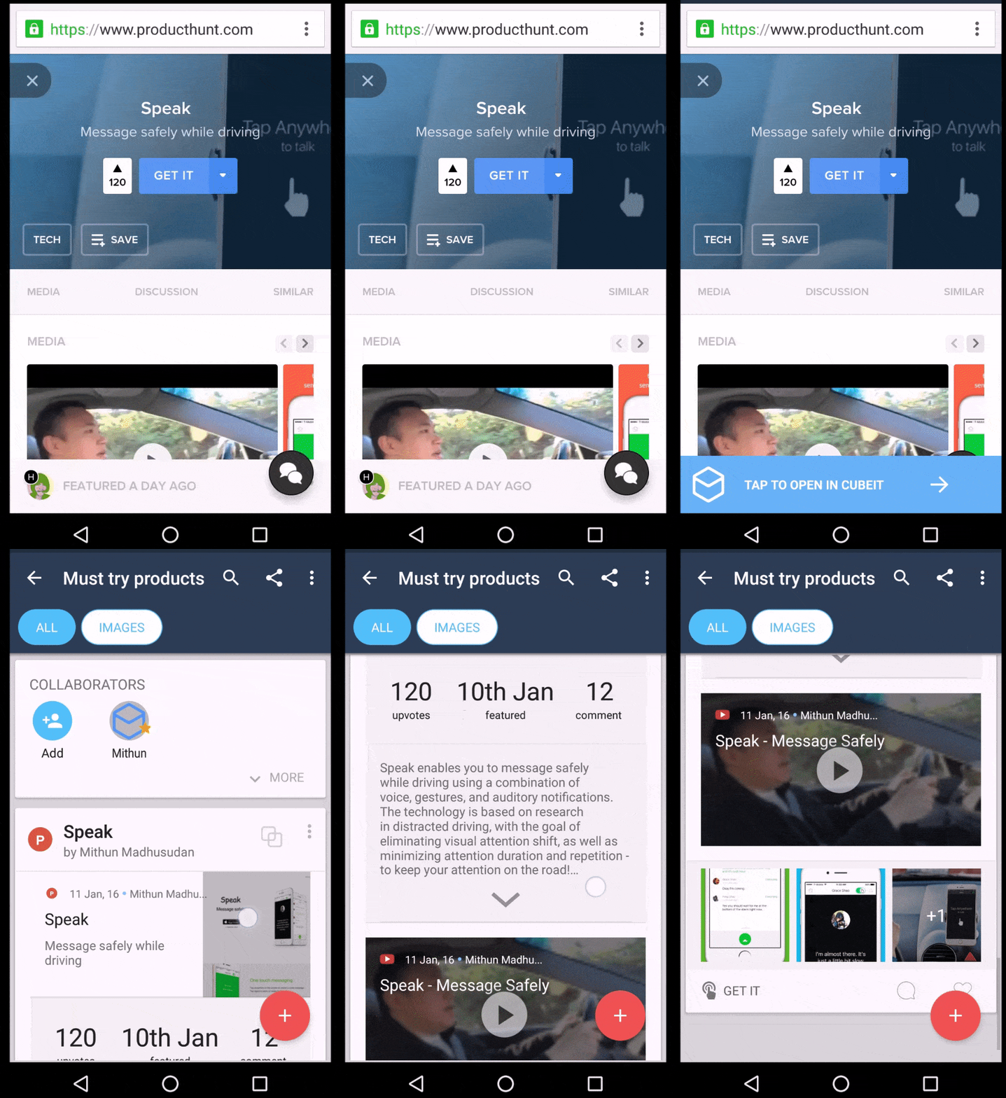
Here’s a GIF of the app in action
Why should I use it?
So this is a question we’ve gotten quite a lot – what we are building is not easy to explain (like fresh food delivered in 45 mins), and we’re still trying to find the magic words which help us immediately connect with our target audience. I’ll explain the benefits of Cubeit over other well known apps
1. Cubeit is Pocket + A collaboration angle – you can build a shared list of interesting content with friends.
2. Cubeit is a better Evernote because of the way we represent content as cards (better for mobile)
3. Cubeit is a shared Dropbox folder – you can save any type of content (links, videos, files, images), and the experience is optimized for mobile. (nobody uses Dropbox on mobile because the experience is shitty)
Here are a couple of example Cubes we’ve created (You can click through the cards in the phone to access them in the browser)
3. Resources for Product Launch
How do I use it?
1. Install the app
2. Create a Cube (a collection of content)
3. Add content in the Cube by sharing from the browser (just like you share to Evernote) or share from other apps (Twitter, Maps, YouTube, Browser, Medium etc)
4. Share the Cube with friends so they can also add interesting content they like.
We have a Chrome extension as well, so you can add content directly from your desktop and save it in the app.
What we are looking for:
Really need feedback on how we can make the app better for you – we’re still early in beta, so there will be a lot of bugs (sowwiee!). If you can see a use for the app and want us to build some features, do let us know!
Here’s the link to the Play Store and here’s the website (The website says collect info about new products – that’s because we’re focusing on a niche tech audience right now)
Cheers!
The Cubeit Team
@cubeitdotio
***
UPDATE ON JULY 12, 2016 ADDED BY EDITOR:
MANY CONGRATS TEAM CUBEIT for getting acqui-hired by Myntra!
***


asha chaudhry
hey mithun,
i clicked on the startup india link and liked what i saw 🙂
very cool.
i was just wondering what a TRH card would look like :))))))
Mithun Madhusudan
Thanks Asha! The best part about the web view is that you can collect content about something you’re passionate about and quickly send it to someone for reference 🙂
Will get you a design for the TRH card soon 😀
Raz
Hi Mithun,
The app has a really nice look and feel to it.
There are some similar apps out there already:
1. Pocket (getpocket.com/) – works on web, iOS and android. Curates links / content, but not calendar / events.
2. List (http://www.li.st) – works on iOS. Curates a list. Users can see lists prepared by others users as well.
My feedback on initial use (approx 20 mins of tinkering around):
1. Can all the notifications asking for permission (to use google+, access calender etc.) come up at once only. Currently they come up one after the other. Not a deal breaker, but it would increase user interface happiness level to have all the notifications appear only once.
2. Include a default set of pre defined cubes (or give the user suggestions to include them) e.g. movies to watch, wish list, research, archive etc.
3. The red colored add button that opens up the menu for copy-paste link, create event, add location, take note, my content – could these be small icones (similar to the add collaborators icon) on the screen itself – that way it reduces one step to access the menu for adding something to the cube.
Where else could I get in touch with you for more feedback?
Alok Rodinhood Kejriwal
Whoa!! Get it for itunes man!
How can we use this for therodinhoods?
Mithun Madhusudan
Hey Alok, We’re in the process of building out a web app, and then iOS. 🙂
The easiest way I can think of using it on iOS is starting a shared reading list – people can add interesting articles they come across about entrepreneurship/technology, and you can access it at your leisure. Works for small groups, not sure how effective it will be for one as large as us!
Another way is just sharing the web link – read only access – of a collection of articles as I’ve done above (access it in the share external menu). It’s a really easy way to share research/reading about a topic you’ve done.
Mithun Madhusudan
Hey Raz!
Thanks a ton for trying us out and the great feedback 🙂
1. So the notification is something that Google controls, we only have access to ask questions at a few pre defined times. We’re looking at how to fix this – Marshmallow has something similar to iOS I think where we can trigger asking for permissions at specific times in the app.
2. This we are working on now. You should get a Cube of tech/product news every couple of days (manually curated by the Cubeit team) suggested by the Cubeit Bot. Over time this recommendation system will become better as you are more active on the app and add more friends.
3. UI fixes are something we are continuously iterating on. We found from data that the Add content flow is a little confusing and throws off users, because there are too many steps. In Alpha we are testing a new flow to add content which is a chat/command based interface. A set of pre defined words which trigger actions like taking a photo, searching YouTube, or adding a location without you having to leave the app.
About the other apps – Pocket is only for public content from the web, but in Cubeit you can add your files, email, contacts – any kind of data you use on your phone, so that is an advantage. Plus sharing is one of Cubeit’s key features (Pocket is trying out its shared reading list in bet). And list is also designed to content shared with a larger groups, whereas we are looking at smaller, more private group sharing as a use case.
You can shoot me an email at mithun@cubeit.io any time 🙂
Thanks again!
asha chaudhry
hey many congrats mithun, nithin and team on getting acqui-hired by myntra!! good luck!
https://techcircle.vccircle.com/2016/07/11/myntra-acqui-hires-cubeit-to-expand-technology-team/
asha chaudhry
ps: looking fwd to the learnings from the transition!! keep sharing 🙂
Mithun Madhusudan
Thanks Asha! 🙂