Helllo Rodinhoods,
Do you think travel planning is tedious and boring? I beg to differ. It can be just as fun as the journey itself. Give me a minute and read on.
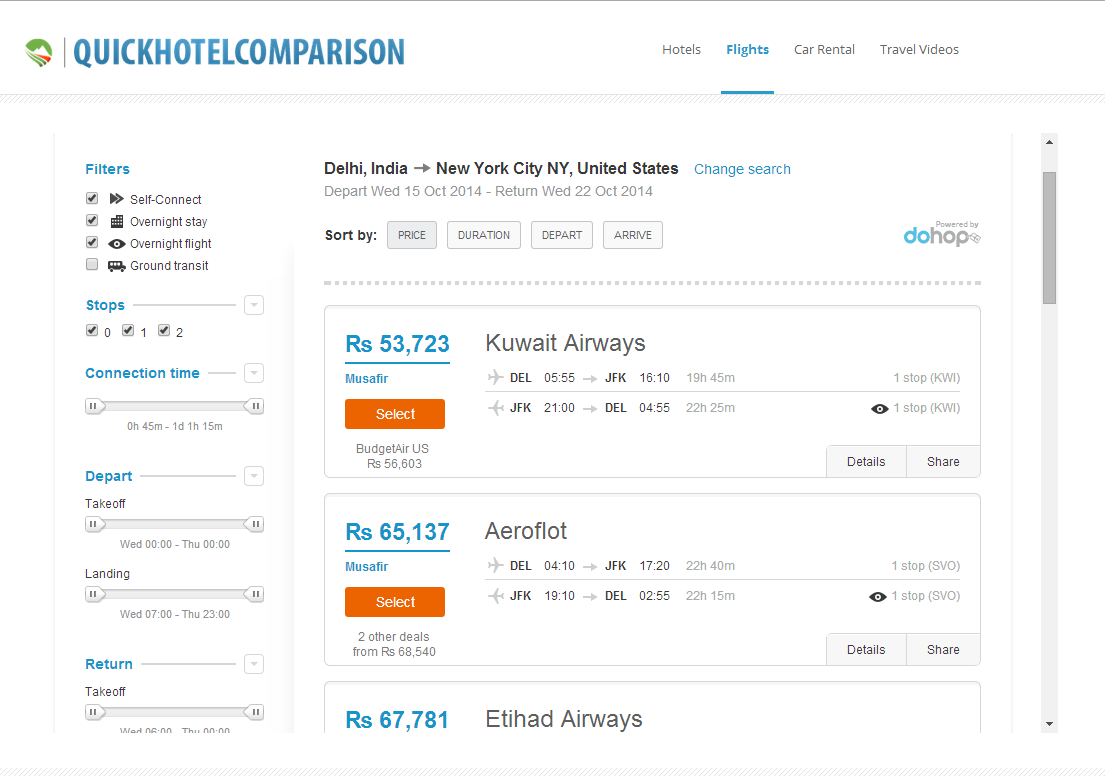
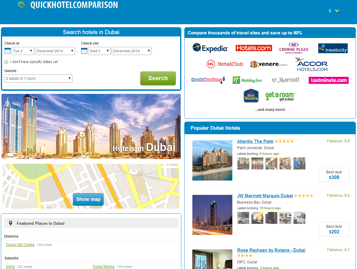
I’m pleased to announce the launch of my latest venture QuickHotelComparison.com – which lets you access over 5 million hotel deals, flight deals & car rental deals in a super sleek and simple “Apple-esque” interface.
With just a few clicks (or taps) you’ll have the best hotel, flight & car rental deals to chose from to make your journey affordable and enjoyable at the same time.
Not only that, we also offer lots of additional tid bits of relevant information such as featured places, points of interests and attractions in a particular city, as well as user generated reviews & ratings aggregated from some of the top travel sites around the world.
Enough talk. Its action time. Go to QuickHotelComparison.com and tell me if I have succeeded in delivering what I claim to deliver in my message above or not. Love it? Hate it? I’m all ears. Give me brutal feedback. 🙂


Indy Singh
I understand you are using HotelsCombined platform – any way to remove that and white label it 100%
2ndly, not too keen on the domain name… considering you offer more than just Hotels.
What differentiates you from the 100’s of other OTA’s out there?
Syed Sameer
Yes Indy it can be fully white labeled – I haven’t just bothered doing that yet as the site is still in beta and I’m focused on marketing.
I understand your point about the domain name – I’d say yes we do offer more than hotels but the main focus is on hotels.. but yeah I agree I might have had come up with a better brandable name for this.
As far as differentiation is concerned I think the UX / UI is really awesome, this is my number 1 gripe about most OTAs that I used over the past – the design is often horrible, sorting out deals is a pain and lots of ads / irrelavent stuff everywhere. Cleartrip.com is the best designed OTA out there in my opinion and I’ve tried to do something along those lines.
asha chaudhry
syed,
do you have a twitter handle? i went to the site and didn’t see a fb pg or twitter handle.
pls add it at the end of the post – it helps me when i share your post over twitter. thanks.
Sampat Bhansali
Why get into already a cluttered market, you will be lost in the crowd
SAMEER MARATHE
Hero image is too big. I think the deals would be better noticed if they are above the fold. Can you have rotating heroes of the deals?
Domain name is too long. You offer more than just hotels, though it is focused on hotels. I would rethink the domain name.
Alok Rodinhood Kejriwal
Your basics are not in place!
I can check in on the 9th but cant check out on the 11th?
Sorry – very pissed…