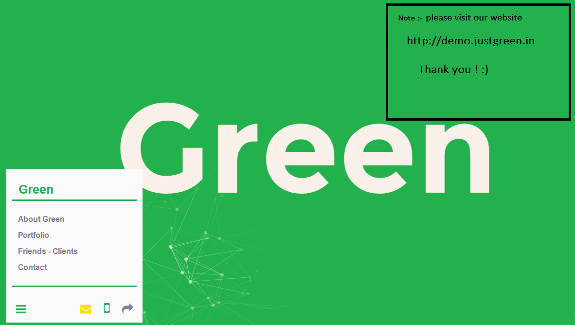
i am young entrepreneur from surat. i have started my venture “Green” as software company to earn some income so i can invest it in my R&D and Products.
Today i need your help to review my website, specially contents. your all +ve and -ve feedbacks are welcome. This review is just to improve the Quality of content of site.
Thank you in Advance.Please review Green – website
Best Regards,
Mihir Naik
@mhrnik
***
UPDATE: NOV 16, 2015
Thanks everyone for your time and feedback, finally we have update our site and also launched our first android app Buzzer


Karthik M Sundaram
Good start.. Some suggestions –
The concept of planting a Tree after completion of every project is nice and unique – Make it come out more – right now it’s hidden inside About Page
very less on text – You will loose out on SEO. My understanding is that your initial business will come from Surat – Baroda – Ahmedabad area – so work on a consistent SEO strategy. Pick up a theme – say premier software company in Gujarat or even work on the Gujarati pride – From Gujarat serving the globe..
Lots of typos in content – maybe you should sit and review content once more
Cheers!
Mihir Naik
Thanks karthink, sure i will work on SEO point. And nice “From Gujarat serving the globe” line, i will sure try to use it.
yes, i feel there are “tyops in content’ that why i have ASKed here so friends like you, help me to improve. 🙂
Thanks again, Appreciated! 🙂
Anoop Nair
Very nice initiative Mihir and an awesome website design.
Just one thing – If as a customer, I visit your website, I do not find a quick way of contacting your company. I would look for a contact form, or an email id or a phone number on the top or bottom of your website. So, if you take care of this as well along with the SEO part, I think it will help you generate more leads.
Thanks!
Darshan Bhambiru
Green is often associated with Nature. With so much focus lately being put on the Environment, we see Green being used in this capacity, but it can also be used to signify Jealousy and Envy. Nevertheless, Green can have many different meanings, you also have made nice use of the Modern Hamburger Design One of my Personal Favorites “Windows 93 on Browser“
Here are some 50 odd GREEN websites you can refer and compare as a collection, to check what you like Best Resources out of Them to Use on Yours as for Inspiration.
CHEERS!!! Good Luck to You and Nimish!
Mihir Naik
thank you for your valuable time and input. i will correct this contact us point and get back soon.
Mihir Naik
Thanks !
Alok Rodinhood Kejriwal
Sorry, but I was highly disappointed. The about us was very non descriptive of what you do? I just saw 3 logos in the middle?
What is the purpose of your site?
Mihir Naik
first Thank you sir, for your input!
And do you really think sir that it needs more description ? because i tried it to cover in “what we do” section ! and in “service” section, it contains that we do “Cloud app, web app, web design…”. till i have to provide more detail ?
Pls share your input. it will be highly appreciated.
Alok Rodinhood Kejriwal
my bad!! :((
Somehow About never loaded up for me… And thats probably what confused me
GREAT going!!
Mihir Naik
huff thxs ! now i have new issue of loading and resolved it soon !
thank you again sir for time and the critique! 🙂
asha chaudhry
mihir – just one quick feedback – pls don’t use any sms lingo on your website.
“Bcz we are Skilled and Brightest minds in the industry and Quality work is our passion and ultimate Goal.”
also, honestly it doesn’t really mean anything!
your grammar issues are disturbing. [and many more??]
“We Love design. We Love code. We craft simple, easy and amazing websites, web applications, mobile apps and many more. We create user experiences that transform brands, grow businesses and make People‘s lives better.”
pls sit with a friend (or a professional) who can polish what you’ve written.
all the very best. i’m sure you’re great at your work – just don’t let the language issues spoil your image!
Mihir Naik
thank you mam ! this is the input, i was looking for and sure i will work on Grammar and writing. Thank you again !
Abey John
The site is BAD. The domain name is lousy but usko chala sakta hai. If Amazon can sell books then Green can sell web design and dev.
Focus on any one thing you can do. Yes, yes, you are the wunderbar brains of the universe but in the marketplace you need to actually make a sale. A declaration of your skill sets will not help. But this is not where you start.
I’ll give you 3 step process that should help:
1) Answer the question: What are you selling? Be as specific as you can. E.g. WordPress responsive theme design using flat UI principles delivering ultrafast wp sites that load under 3 seconds on a 512kbps connection irrespective of network latency (If you can actually do that I’ll concede your about us page is not crap).
2) Who is your target customer? Do you know what he wants? Do you know what he needs even though he doesn’t know he needs them? This is a difficult hurdle even when you know the industry so out of the gate readup on the target industry and make some guesstimates and then refine it as you go along.
3) Once you have a clear idea about both. Go look up similar agency websites in the industry and see what they do (not WP consulting themes! actual websites that work with customers). Read up on creating high converting websites, the key elements that you need to include on your site and in your copy.
Once you do this you have a clear idea about the key things that matter:
1. What it is that you are selling
2. Who you are selling to.
Then take all this information and approach your site design holding the entire information in your mind’s eye. You should get a more cogent design flow that conveys all the information without distracting from the esthetic element.
Finally you’ll need to periodically revisit and update the site to update and expand the information as your service offerings improve.
You should also look at setting up agency accounts on sites like oDesk and elance.
Mihir Naik
thanks, i will consider these two points and improve.
Perzen Darukhanawalla
Hi Mihir,
The concept is great but I feel the website needs significant more details. I’ve worked on sourcing vendors for the orgs I work for and from that experience I wouldn’t hire a software company whose own website is not upto the mark.
Here are some of the bugs I uncovered:
– When you click on your portfolio nothing happens (even if you don’t have much of a portfolio as a company you could put in samples of individual work your team members have done)
– The Clients/Feedback looks too amateurish especially as there are not much details of what you do on the site. I suggest contacting your clients and asking them to give in-depth testimonials. Or else, you can follow a Problem, Solution, Benefits format like we’ve done here
– About Page – I attended a workshop once which talks about using storytelling for your About Page. Did you know that your About Page is the most visited page on your site. This statistic is consistent across all sectors and its more popular than your services page. Use this page to get the mileage you need. The best way is to tell a story – think of the components your fav hindi movie has – some past context, a challenge you faced, what you’re doing now, why you’re doing it, why others should trust you. I’ve tried to apply these principles in my own About Page which you can see here. Had also written a post about it here.
Finally as most people have already pointed out you need an external person to review all your content for language issues before it goes live.
Hope this helps 🙂
Mihir Naik
thanks, i have asked one of my friend for “about us” content , and yes client and portfolio pages also need update.
thanks for the links. Helpful 🙂