
Hi every one,
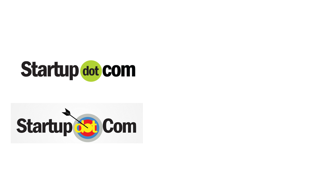
Startupdotcom is the proposed name of a magazine on startups. I need suggestion on which logo i should take up for the first edition of the same. First logo looks nice but the second logo has a meaning. This is just my opinion and i need opinions from you all experts.


Gurudatt Nadiger
Go for the first.
Indy Singh
great domain name for your venture there!
The first one looks better. You could do something special with the two T’s in the word sTarTup to make it stand out – just a ThoughT!
praveen sinha
First one is better, experiment little bit more with that one only. If you like the second one, then I suggest play a little more with it. Make the bulls eye sign little more 3D or try different colors.
Darshan Bhambiru
Try this for an Idea if its a Magazine 🙂
ankit.dudhwewala
First one is good.
Vinay Sarda
First one! It is simple, clear and elegant. It is easier to print the first logo on all types of material.
Nikunj Bubna
Hey Fathima,
Would love to have a startup magazine that offers differentiated content as compared to other blogs like Techcircle, NextBigwhat, YourStory, StartupCentral, etc.
The 1st logo looks simple, elegant and powerful and if given a choice between the 2, would go for the 1st one. However, wondering why the word ‘Startup’ needs to look so dull, boring, formal, bland, etc. with a straightjacket font in black.
Startups are associated with the following qualities: unstructured, sexy, fun, colourful, hatke, etc. Why not use different colours, font sizes, fonts, etc. to represent each letter of the word ‘Startup’ & the challenge is to use them so skillfully that it doesnt look too gaudy or flashy.
Alok Rodinhood Kejriwal
First
Nithya Prabu
First one is perfect.
Great domain name as well. Good luck!
Mitesh Agaria
First…(simple and to the point)
Mrigaen Kapadia
Go for the first. As someone mentioned above its clear and precise. The second one has too much going on.
Fathima Sherin
Hi,
Thank you for the suggestion. It would be great if you could explain more on how you would want the contents to be. Any kind of suggestions are welcome.
Thanks
Sherin
Fathima Sherin
Thank you all for your valuable suggestions. thank you so much :)) Gurudatt Nadiger , Indy Singh, praveen sinha, Darshan Bhambiru, ankit.dudhwewala, Vinay Sarda, Nikunj Bubna, Alok ‘Rodinhood’ Kejriwal, Nithya Prabu, Mitesh Agaria, Mrigaen Kapadia,
Abhijeet Mahajan
Hi Fatima,
May be i am answering too late, but sorry till now i was just busy in reading the post and awestruck with all the stories around here!!!
My suggestion.. Go for First logo..
more simpler and elegant the logo is more is it valuable. Logo should be as simple as possible. The circle around “dot” gives you flexibility to experiment with colours through various sections and platform.
If u still need changes experiment on the fonts thats it.
Hope its helpful!!!
Cheers!!!
Rahul Am
First one looks better particularly for online websites….
second would be a better one for magazine but you would need to fix small thing around it ( that yellow is a dirty fellow….please try some combinations around it specially the ‘O’ in dot
Manmeet P Singh
Sorry, I am not questioning your credibility or anything on this but just curious, do you even own STARTUP.com to be starting a magazine with the exact same name?
My lil’ finding shows that the domain name is under ownership of Startup.com Inc. based out of Massachusetts, United States and you are somewhere in Calicut, Kerala. Also if you go to Startup.com, you would notice that they have a registered sign next to their name (startup.com®), which means you will actually be infringing on their Copyrights by using that name for anything related to startups.
Please note that it’s just my opinion, and not to be misunderstood as a legal advice.
For the logo, I think first one looks awesome. Good luck!
Ssandeep B Teraiya
First, but i suggest you to play with more color options.
Good Luck