Hi friends,
We are a bunch of teammates from different Management Schools in India. We are trying to foray into Banking preparation industry. In that respect we have recently started off with a blog. We want to use the space outside the written area ( a thin strip both to the left and right of the blog) to convey a message for positioning. Since the space on blog is free to us, we want to capitalize on building some perception in the minds of prospective customers who visit our blog regularly.
Anyone of YOU, would like to comment upon this? A few people we talked to said, yours being an educational blog, you cannot use much of banner…try to keep the corners as clean as possible. OPINIONS! CRITICISMS! IDEAS FOR BANNER MAKING!..All are welcome.

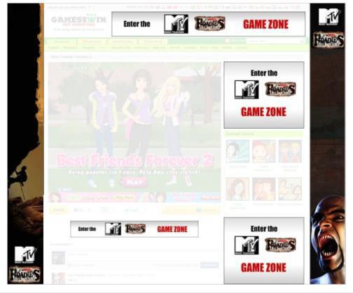
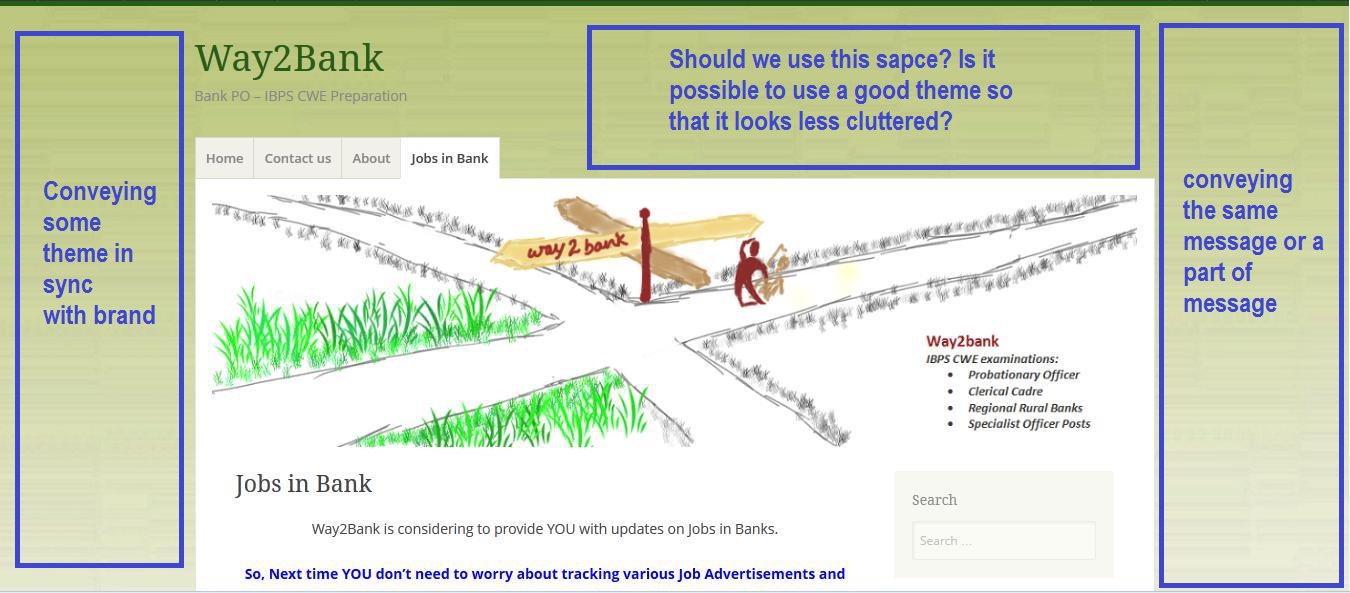 NOTE: The first two images have been taken from Games2Win website for explanation purposes and for making the idea clear. I have no other intention.




Abey John
Hi Aman, notwithstanding all the examples you’ve quoted, you are going about it “wrong”. Filling remnant space with “stuff” sounds reasonable but you also need to watch out for readability and usability issues. From what I can make out the space you are targeting on the left and right are due to a fixed width layout. Switch to a fluid or responsive layout and that’s going to disappear. BUT before anything else – answer this question. What kind of value will those banners provided to your reader and more importantly are you able to measure and track that value? If you don’t have a really good answer that is specific “my reader can subscribe to content”; “my reader can drill deeper into the site”; I would suggest you let it be. Funnily enough hubspot has just published a great collection of blog designs. Check it out.
AMAN SUKHIJA
Hi Abey,
Thanks for replying. Your point on fixed width layout is valid! We need to take care of it.
Regarding the important question: “What kind of value will those banners provided to your reader and more importantly are you able to measure and track that value?”
Actually we are launching our website very soon and want to convey the additional features and value we are going to provide, do you think this makes it relevant. Obviously we want to keep the banner design minimalistic, no cluttered thing.
One important point is how we are going to track the added value or the perception that gets created! THIS IS REALLY TOUGH!
Abey John
Hmmmm. I will be doing a post soon on internet marketing. Stay tuned.
AMAN SUKHIJA
Sure Abey!
asha chaudhry
about time abey! welcome back!!!
Dr Saurabh Bhatia
My Take: The spaces shown by you in your blog screenshot should NOT be used.
See indiatimes.com. there is a 6 column formation with numerous rows. Can you make any sense of that website? using background will convert your blog to a five column structure.
There is a reason why 2 column blogs are MOST popular.Two column is most functional, distracting your readers to a minimum. Use the right light pale column to feature your stuff. There are 2 good ways of showcasing your features:
On a lighter note
There was a song from Race 2 i saw while passing by the TV. Foreground is in focus with Saif, singing the song. In distant background, Deepika, out of focus and in white, tattered dress is doing some calisthenic moves. Even though the focus is on Saif and he is saying stuff too, all you can do is watch Deepika in background coz she is constantly distracting you. This is a common stuff in photography but see if you get a message from it. You can use this perspective constructively.
AMAN SUKHIJA
Dr. BhatiaThanks for the valuable inputs!