One of the first questions/comments that I get from almost everyone who reviews Knowledge Maps is — It looks a lot similar to Medium. Is it embedded in Medium, does Medium have a framework or did you guys bluntly copy their design?
Well, the third option is the right answer — we bluntly copied their design.
I am writing this post because — instead of getting a constructive feedback on the platform, my interaction with most of our early adopters stays limited to us copying Medium’s design and me trying to explain the reasons behind it.
In my defence I would like to begin by saying — I love medium. It is probably the only site that I spend most of my time on apart from Knowledge Maps and Facebook (and Facebook only because it’s a great channel for user acquisition and conducting customer interviews. FYI, more people respond to cold Facebook messages than to friendly emails).
The only thing that I love more than Medium is Medium’s design. It is such a brilliant piece of art. The perfect line-heights, icons, font-sizes, font-families, color palette, blank spaces, margins, everything. It’s just so perfect.
Being a first time developer (doing both frontend and backend in my two member startup), getting inspired by Medium and copying its design was probably the easiest pitfall for me, given that we are working with the “fuck it, ship it” attitude. I read in an Andrew Chen blog post that the fastest way to reach Product Market Fit is to copy 80% of what already works and innovate the remaining 20% (the percentage that forms the core of your product).
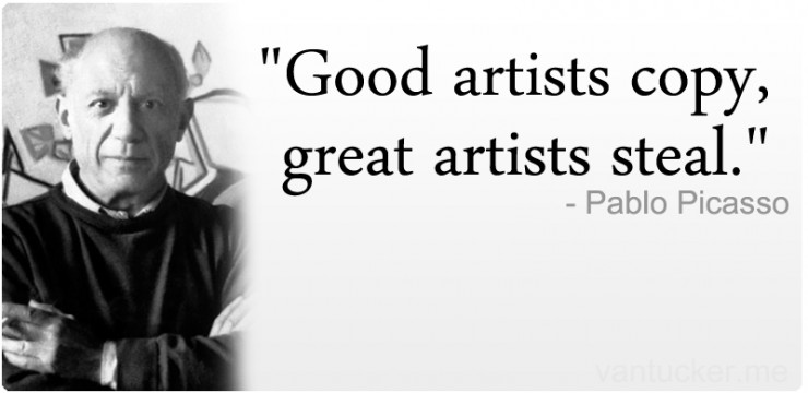
Now you may say, I could have made a few changes to the style/colors/font or even font size. But in my defence I have Picasso, T.S. Eliot, and Steve Jobs. Picasso is arguably quoted to have said — “Good artists copy, great artists steal”. Now, that quotation might be false, but what about T.S. Eliot saying — “Immature poets imitate; mature poets steal.”? There’s quite an evidence for that. As for Apple, we all know where the GUI and mouse came from.
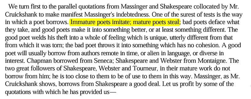
Passage from T.S. Eliot’s book The Sacred Wood: Essays on Poetry and Criticism (1920)
Now, I’m not the lonely culprit. But the thing is — imitating Medium’s design is making us pay quite a high price. The reason — Medium is a well known platform, and we are just another dorm room startup. People know and value Medium, they don’t know us yet. Whereas, in the case of T.S. Eliot and Apple, most people hadn’t read or seen the original work. Apple’s mouse was still new to people’s eye. And so stealing didn’t matter much.
And as of now, we can’t really change the design of Knowledge Maps:
1.) There’s just so much pending shit that we need to ship.
2.) We really don’t know which other design would work for us.
But in the near future, we are definitely going to change it. And if you happen to be a designer, or maybe you are learning about design or maybe just a creative person who loves beautiful design and happens to like the concept behind Knowledge Maps, we would love to get in touch with you.
For other startups who don’t have designers on their team, here are my key takeaways:
1.) Never steal/copy design of a well known product. People will compare you with them, even if you are offering a completely different value proposition.
2.) It’s great if you can copy the design of a failed product which had a great UI and UX. The reason is — you’ll be able to ship it early. And most people won’t be able to get the imitation because the imitated product wouldn’t have been popular.
3.) The biggest drawback of copying/stealing design of a well known product is — you’ll find it difficult to get a constructive feedback from the early adopters on your own product.
If you have had any such experience or have any suggestions, please share them in the comments below or ping me on twitter @arjun_tuli
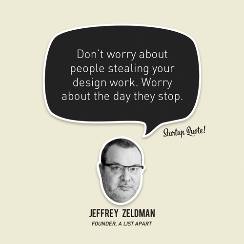
Just before I end, here’s a compliment to Medium:




asha chaudhry
wow. what an interesting, honest admission.
i hope you find a designer who can help you. in the meanwhile keep shipping.
“There’s just so much pending shit that we need to ship.” is a sentiment that resonates with lots of us!
Arjun Tuli
Thank you so much Asha! 🙂 I always see asha in all your guidance and support. Will keep shipping!
Anamika Joshi
Hey Arjun
Kudos for blatantly putting it out.
When I mention Utpatang to people, the first thing they ask is – “Is it the same as Chumbak and Happily Unmarried”? I have a strong reason that why we are not them. But it depends on how I choose the words to ensure I have convinced them enough. Our initial line of products categorically are similar – but not otherwise – both in sense or design. But they are popular and you can’t beat them at that. We always had a different line of products in mind, but we needed a start. We would soon be coming out with products which would help us stand out. But that is when we are able to move upwards and onwards with what we have in hand.
I have little clarity about stealing/imitating, etc. But I do believe that instead of trying to build anything differently which someone has already worked upon, it’s better to take lessons, apply them and work on things that makes you stand apart. Haven’t seen your site. Will explore!
Best Wishes!
Arjun Tuli
Hi Ambika!
I recently visited Utpatang (when it was showcased on Rodinhoods) and loved the products out there. My favourite one is – “Park your ideas here” street signage.
I can completely relate to what you have been going through. And as far as my experience goes (with an earlier project of mine), this also makes it hard to pitch it to the investors. Most people see short term vision and compare your current state with something similar that’s out in the market.
I would love to see the products that you would be launching as you realise your vision.
The database showed me that you checked out the platform. Thanks a lot for taking out time to play with it. Any suggestions or feedback that you have got? Would love to hear it out 🙂